I like to use gradients a lot across my work — presentations, product visuals, landing pages. When they’re done well, they can carry a large amount of the visual identity. When they’re not, they tend to feel generic.
While working on branding projects, I kept running into the same limitation: most gradient tools produce clean results, but not very distinctive ones. You pick a couple of colours, tweak a few sliders, but the output often sits in the same narrow visual range.
The reference point I kept returning to was OpenAI’s visual language — gradients that feel soft, layered, and consistent. I wanted to understand the underlying approach they took and make it usable in my own workflow.
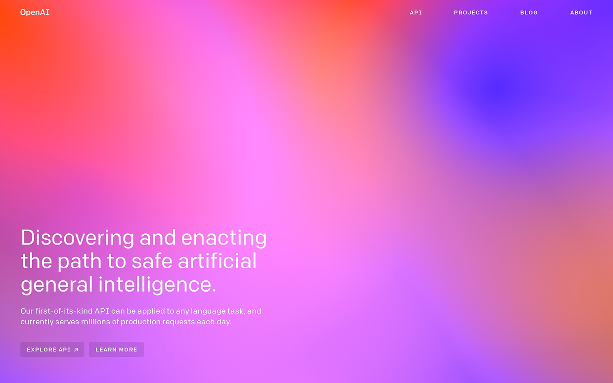

Examples of OpenAI's use of gradients in their branding.
The technique behind OpenAI-style gradients
While researching, I came across a write-up by designer Justin Jay Wang that explored several programmatic approaches. The technique that stood out most was layered radial gradients.
The idea was to create a canvas of multiple oval layers where:
- Each layer has its own position and colour
- Colours fade into transparency
- Layers are transformed and blended together
Individually, the layers are simple. But in combination, they create depth and unexpected transitions.
Layered black-and-white radial-gradient mock.
There’s also a practical upside to this method: this approach means files stay incredibly lightweight. A full SVG can come in at just a few kilobytes, while still feeling visually rich.
Building the tool
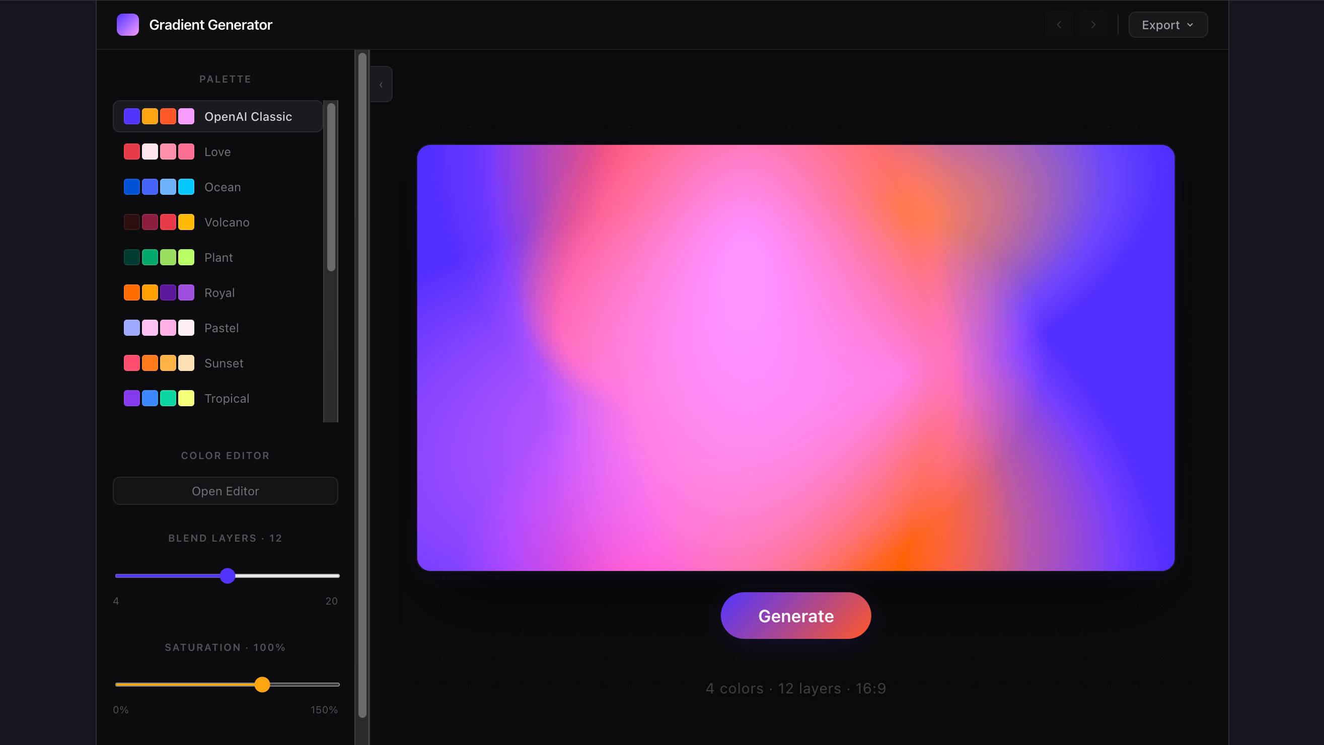
Once I understood how OpenAI had designed their gradients, I vibecoded a tool to immitate the approach.
The process was mostly iterative — adjusting parameters, testing outputs, and refining constraints so results feel intentional rather than random.
Curated palette directions.
I also curated a number of colour palettes, mixing a number of complimentary and contrasting colors to create the most striking effects.
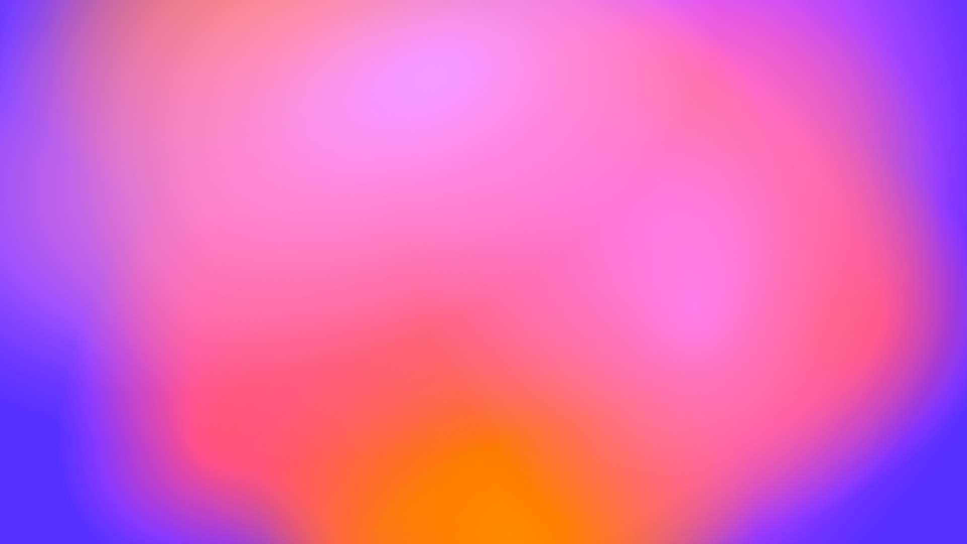
The tool isn’t meant to produce finished assets. It’s a starting point you can refine further depending on the project.
Features I ended up adding
Curated palettes
Curated palettes to keep colour combinations cohesive.
Custom colour editing
Custom colour editing.
Layer control
Adjustable layer count (4–20).
Controls
Controls for saturation and grain.
Aspect ratios
Preset aspect ratios for common use cases.
Export options
Export as SVG, JPEG, or raw SVG code.
Interface and export flow.
Workflow exploration.
Outcome
The most interesting outcome of this side-project for me wasn’t the gradients themselves, but the process behind them.
A few years ago, creating something like this would’ve meant either waiting for a tool to come into existence or investing a huge amount of time into learning how to build it from scratch.
Now there's a new option: define the creative idea clearly, and with the help of artificial intelligence build small, specific personal tools around your own workflow. Instead of designing a single output, you can design a system that produces outputs consistently.
That shift, to me, feels like a meaningful change in how creative work gets done.