A 6th form Graphics project exploring typeface design and distortion. The brief was straightforward: create an original typeface and demonstrate its range through a series of posters.
Starting with the letter A
Before I decided which direction to head in, I started by just playing around with one letter. I tried making it wide, making it thin, adding curves, removing them. Each variation had its own weird personality.
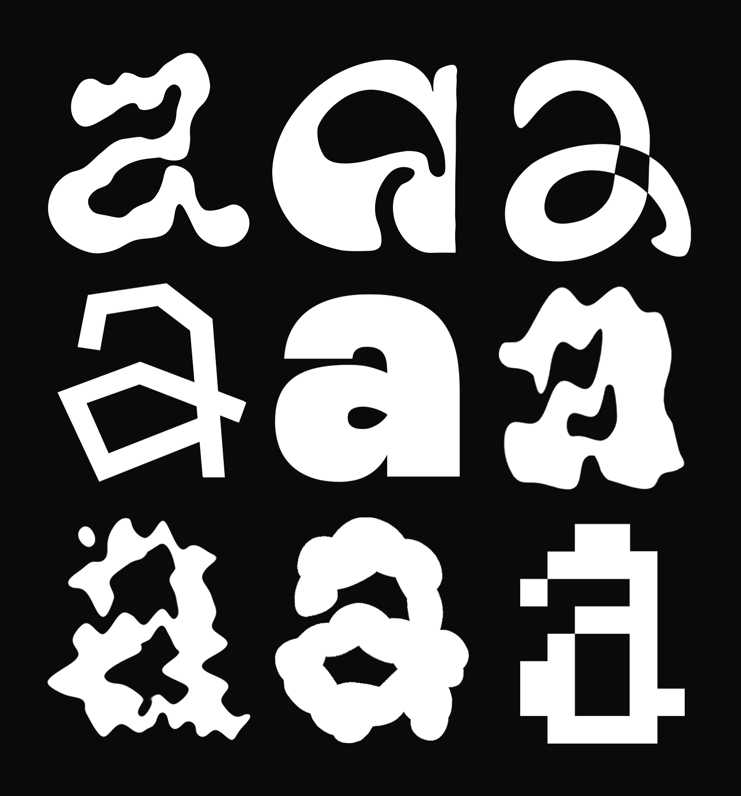
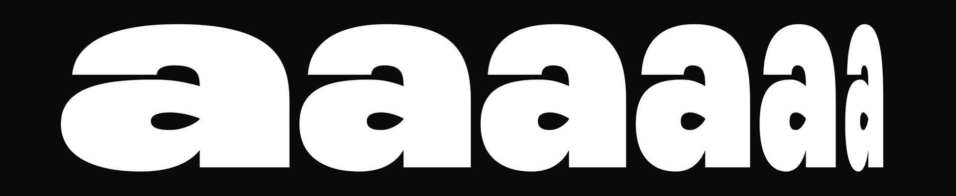
Inspiration and research
At the start of the project, I looked at a range of typefaces and design movements that pushed letterforms beyond their traditional structure. I was particularly drawn to 1960s psychedelic posters, where type often becomes fluid and expressive rather than rigid and readable. Designers from this era treated letters almost like illustrations, which influenced the direction I wanted to take.
I also explored more contemporary experimental typography, especially work that blurs the line between text and image. A lot of these references focused on distortion, irregularity, and breaking the rules of consistency that most typefaces follow.
Building the font
Once I'd found a direction with the letter A, I sketched out and vectorised the rest of the alphabet. I was going for something organic and a bit funky — inspired by 60s psychedelic design, but not a direct copy. I wanted it to feel hand-made and imperfect.
I drew everything by hand first, then brought the sketches into Photoshop. Using the pen tool, I refined the letterforms and kept those little imperfections that made them feel alive. The goal was a typeface that had personality.
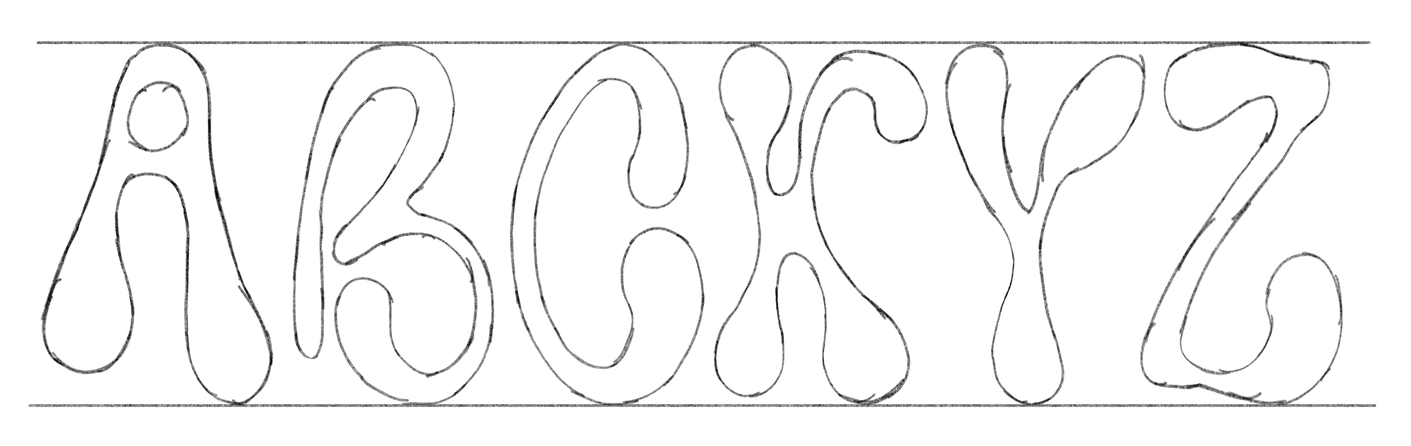
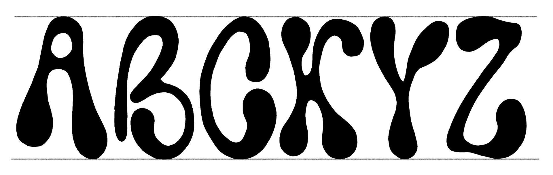
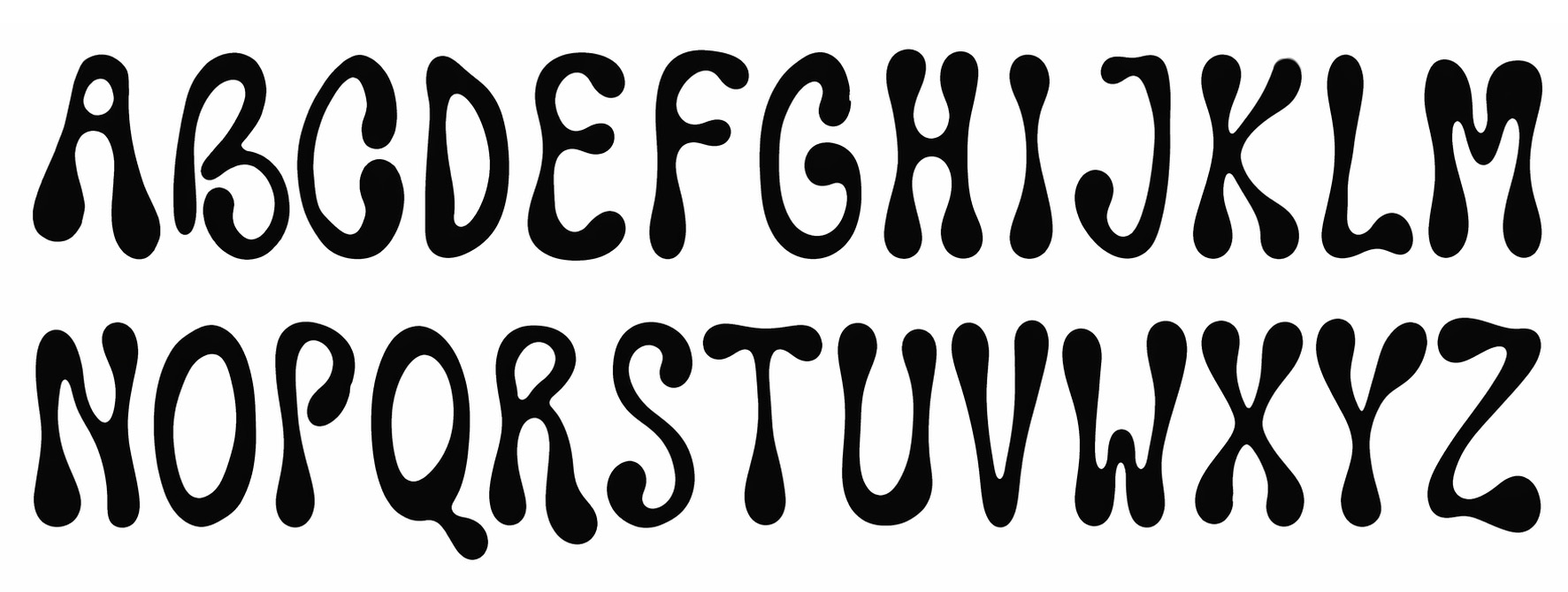
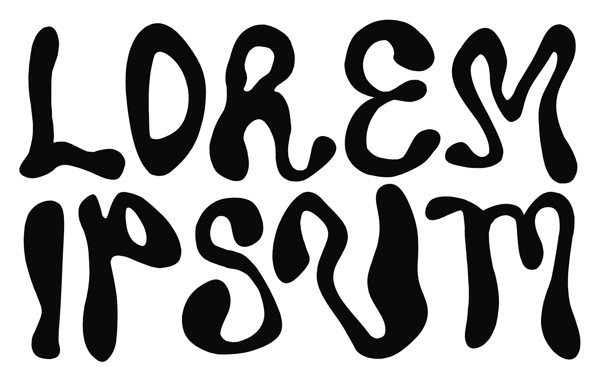
The typeface coming together — hand-drawn letterforms refined in Photoshop.
Breaking it (on purpose)
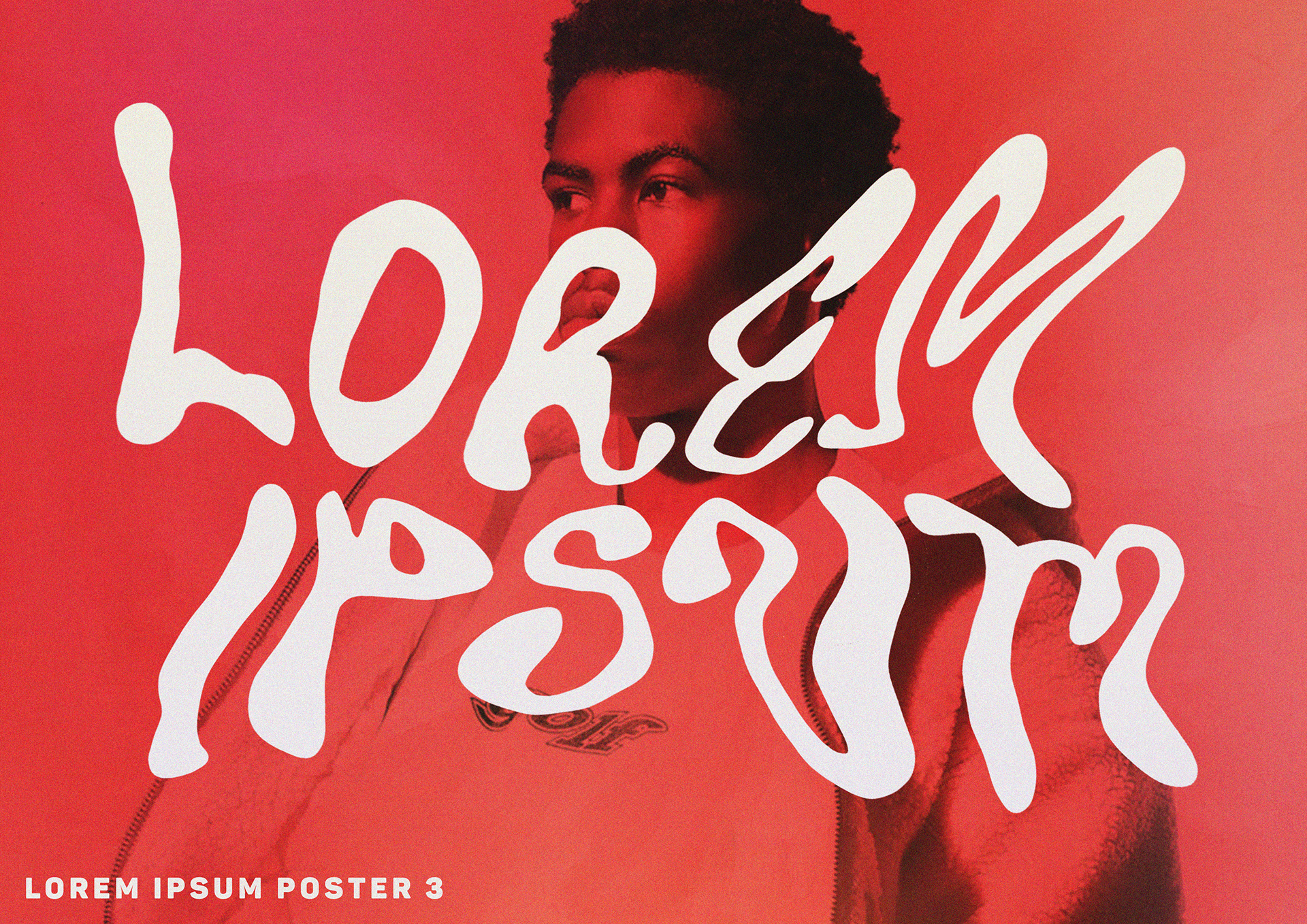
Once I had a working typeface, it was time to test it. I set some Lorem Ipsum text and started pushing it through every distortion filter I could try.
I wanted to see how much the typeface could bend before it completely fell apart. The idea was to show the range of expression possible from a single typeface — from "this is still text" to "this is just shapes now."
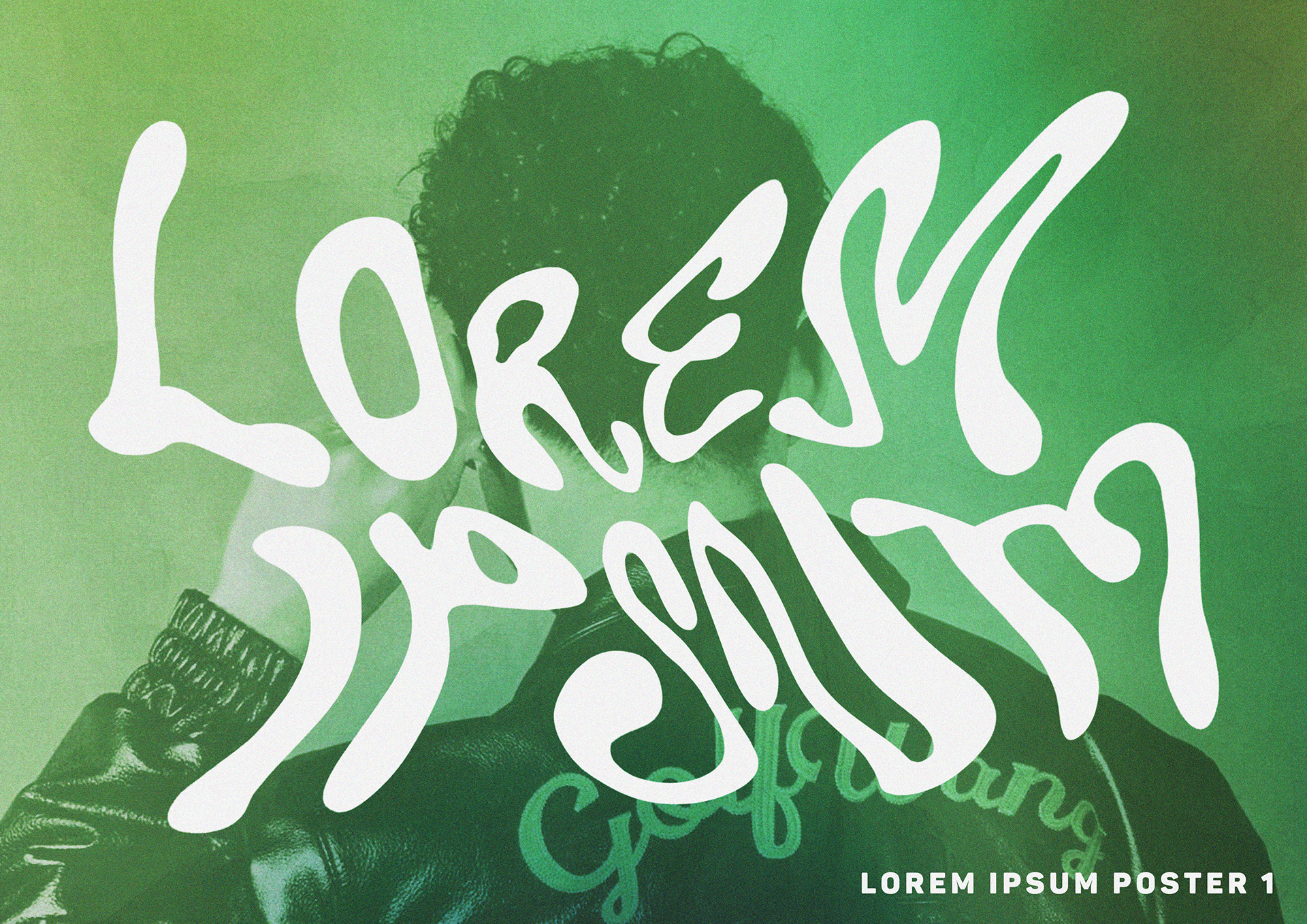
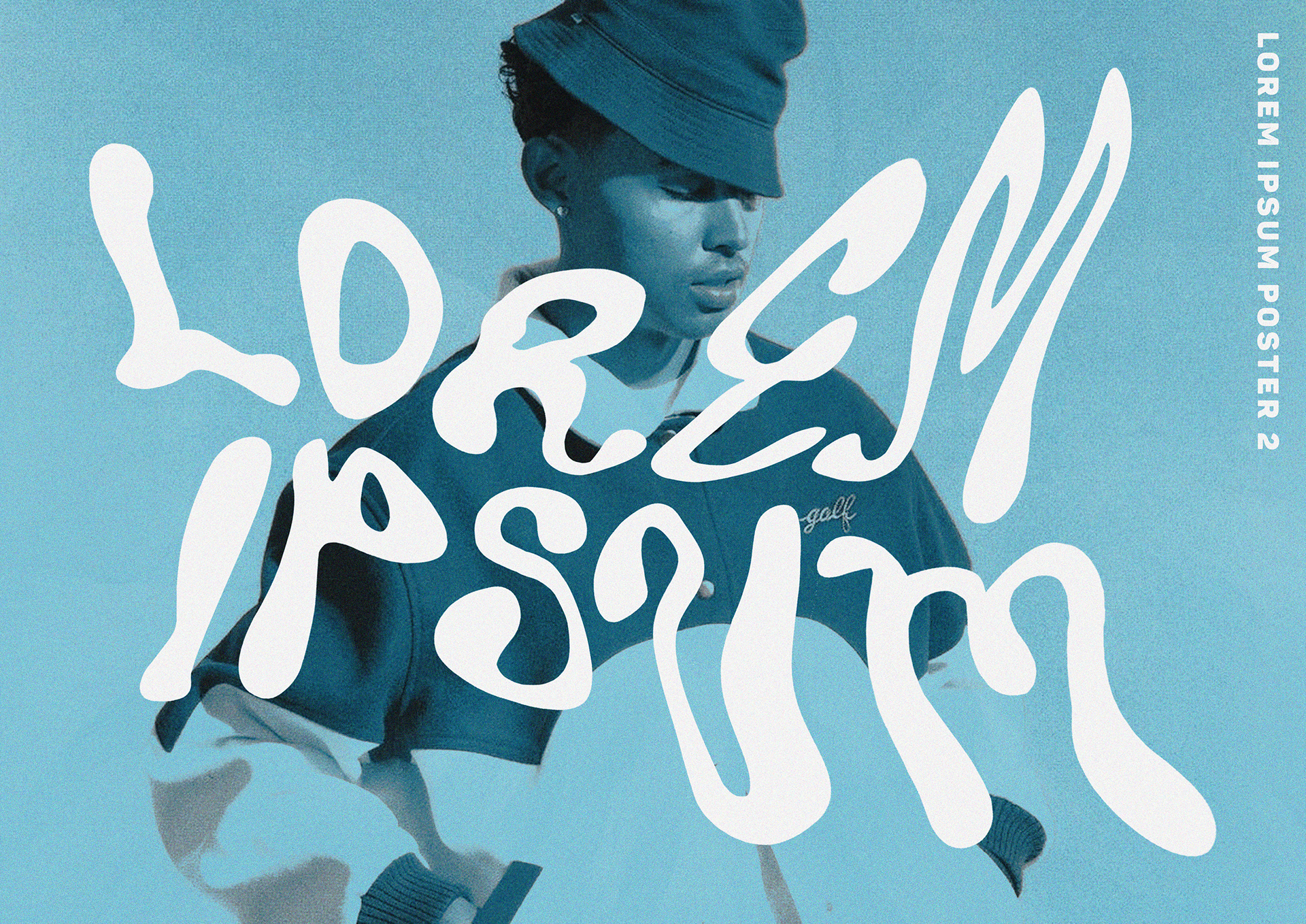
What came out of it
This project changed the way I think about type. Before starting, I saw typefaces mainly as tools for communication, where clarity and consistency are the most important factors. Through this process, I began to see type as something much more flexible and expressive.
Overall, the project helped me become more confident in experimenting and taking creative risks, rather than aiming for a perfect or polished result from the start.