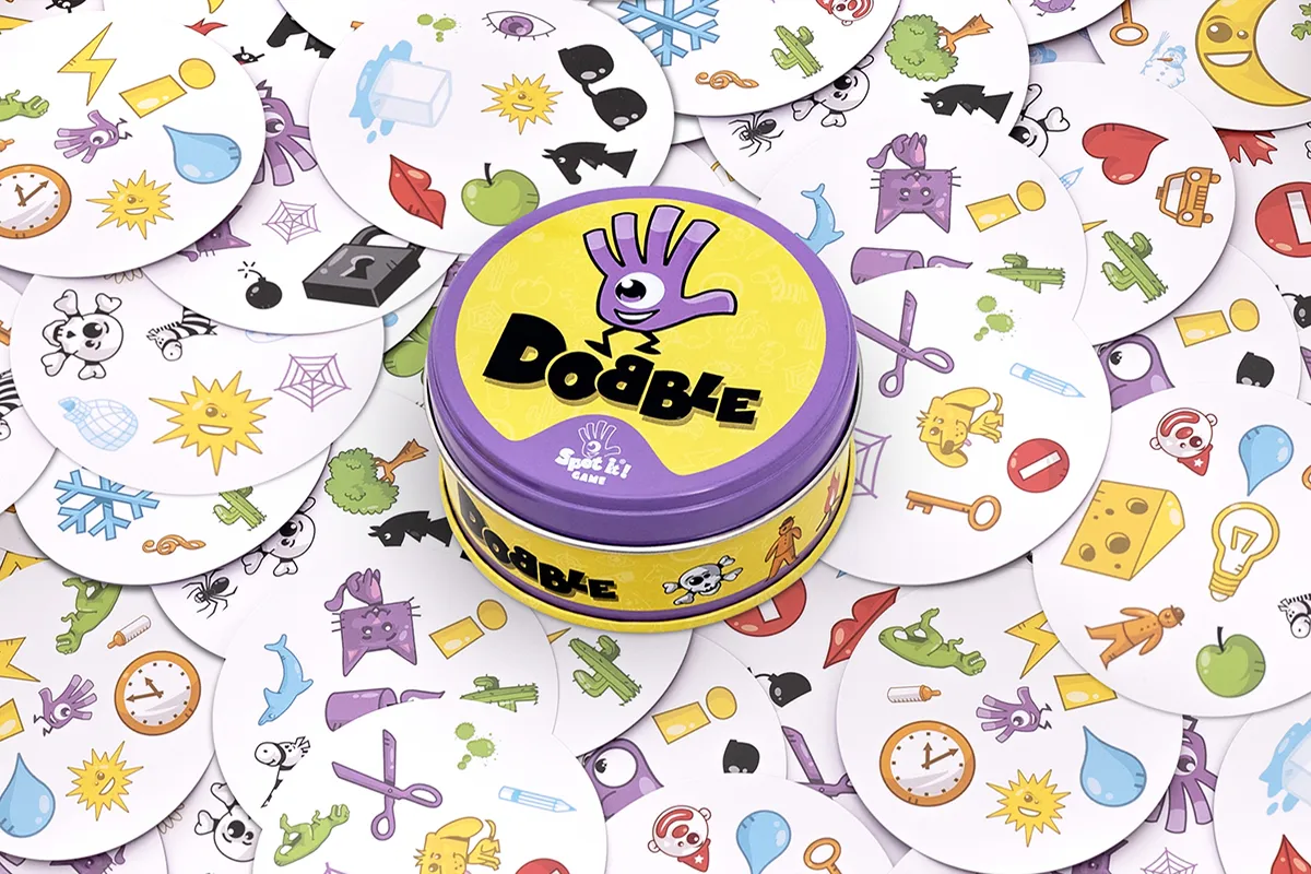
Dobble — the original card game, the basis for the mobile adaptation.
At Amuzo Games, I worked on bringing one of the world's most popular card games to mobile. The challenge wasn't to reinvent Dobble — it was to translate its fast, social energy into a digital experience. My work focused on customisation: designing the elements that let players express themselves and make the game feel personal.
Context
Originally released in 2008, Dobble has sold tens of millions of copies worldwide. Its core mechanic is simple: every two cards share exactly one matching symbol, and the fastest player wins. The mobile adaptation needed to preserve that immediacy while adding depth for a solo and online audience.
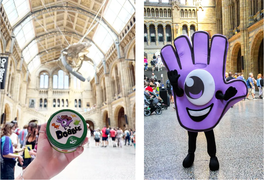
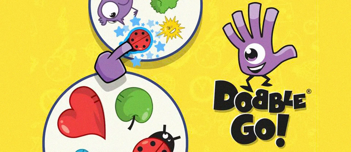
Special editions (left) and the Dobble Go! mobile app (right).
The many editions of Dobble — a globally recognisable brand with a consistent identity.
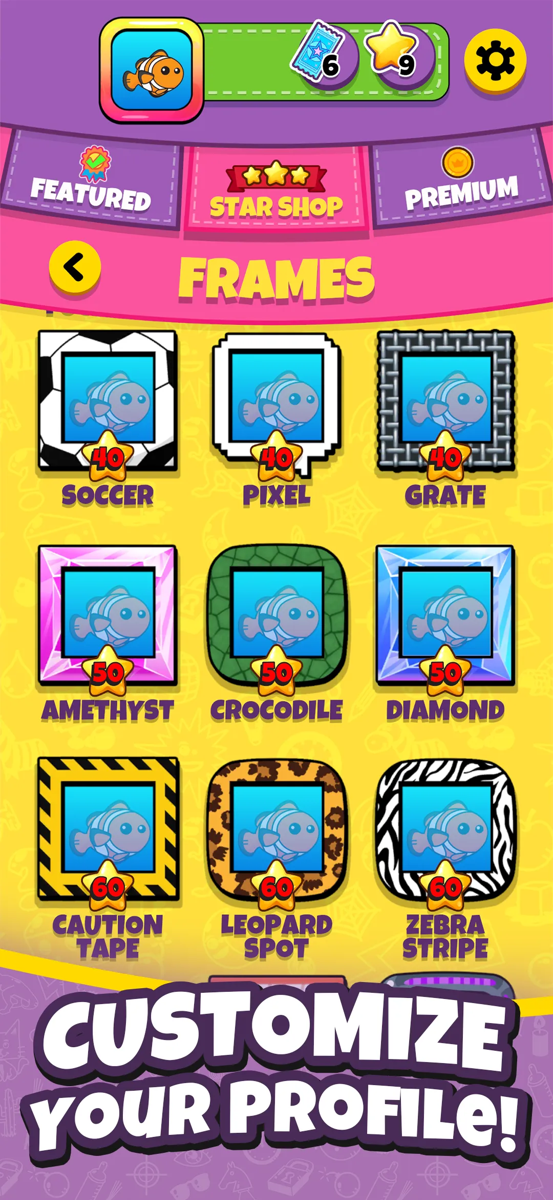
Customisation system
I designed most of Dobble Go's customisable assets — avatars, borders, and banners. These are the collectibles players use to express themselves within the game; they sit at the centre of the player experience. Getting the visual language right mattered.
The challenge was in the combinations. Any avatar could pair with any border or banner, creating thousands of possible outcomes. Each needed to remain clear, balanced, and visually consistent — requiring a systematic approach to every individual asset.

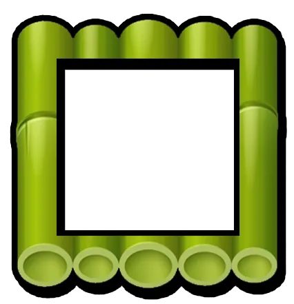

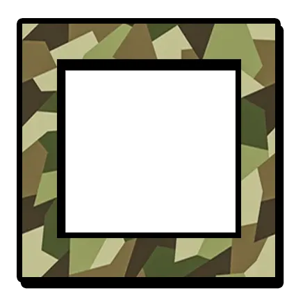
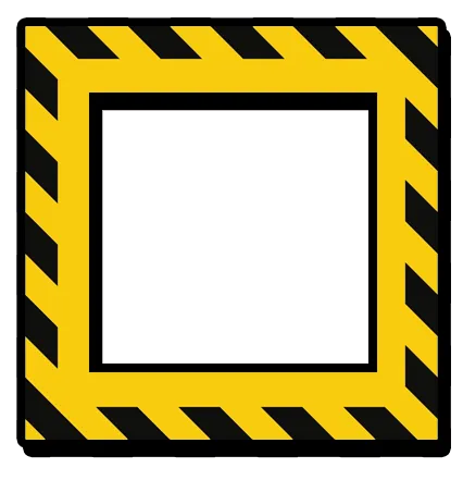
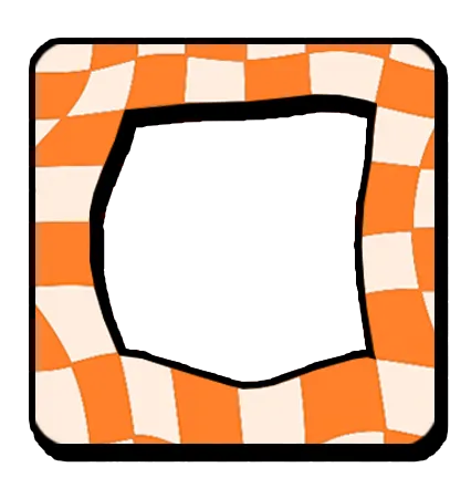
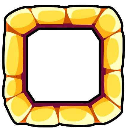


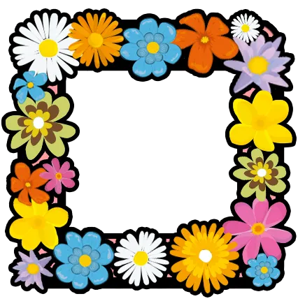
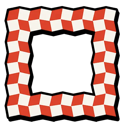

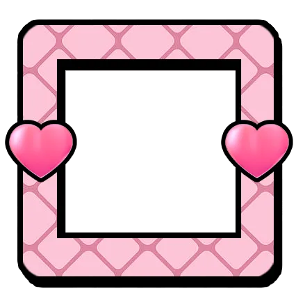

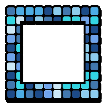
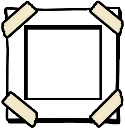
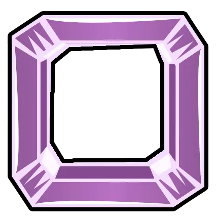

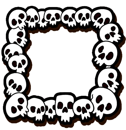

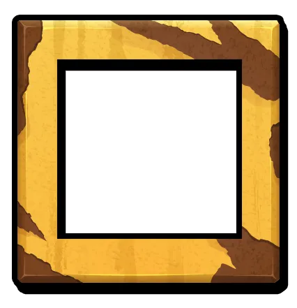
A selection of collectible border designs — 24 of the full set.
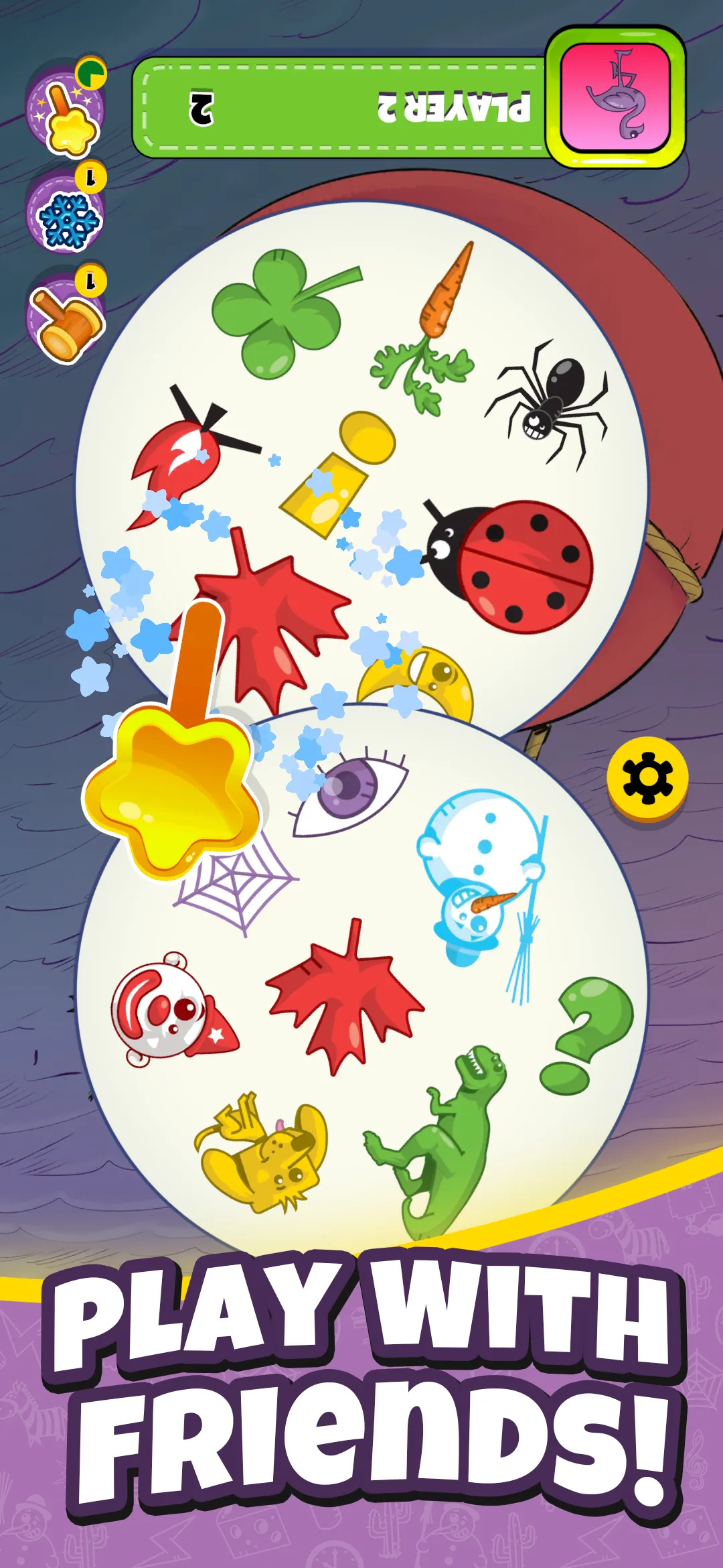
In-game screens showing the customisation system in context.
Advertising
I created and localised marketing assets across multiple formats, screen sizes, and languages. Layouts needed to remain flexible from the outset — text expansion in languages like German meant designing systems that could accommodate significant variation without breaking. Structure first; aesthetics followed.
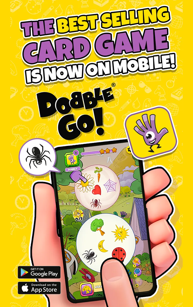
Master advertising layout — designed to flex across languages and formats.
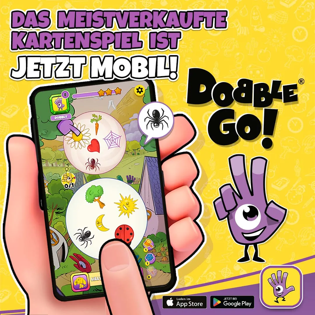
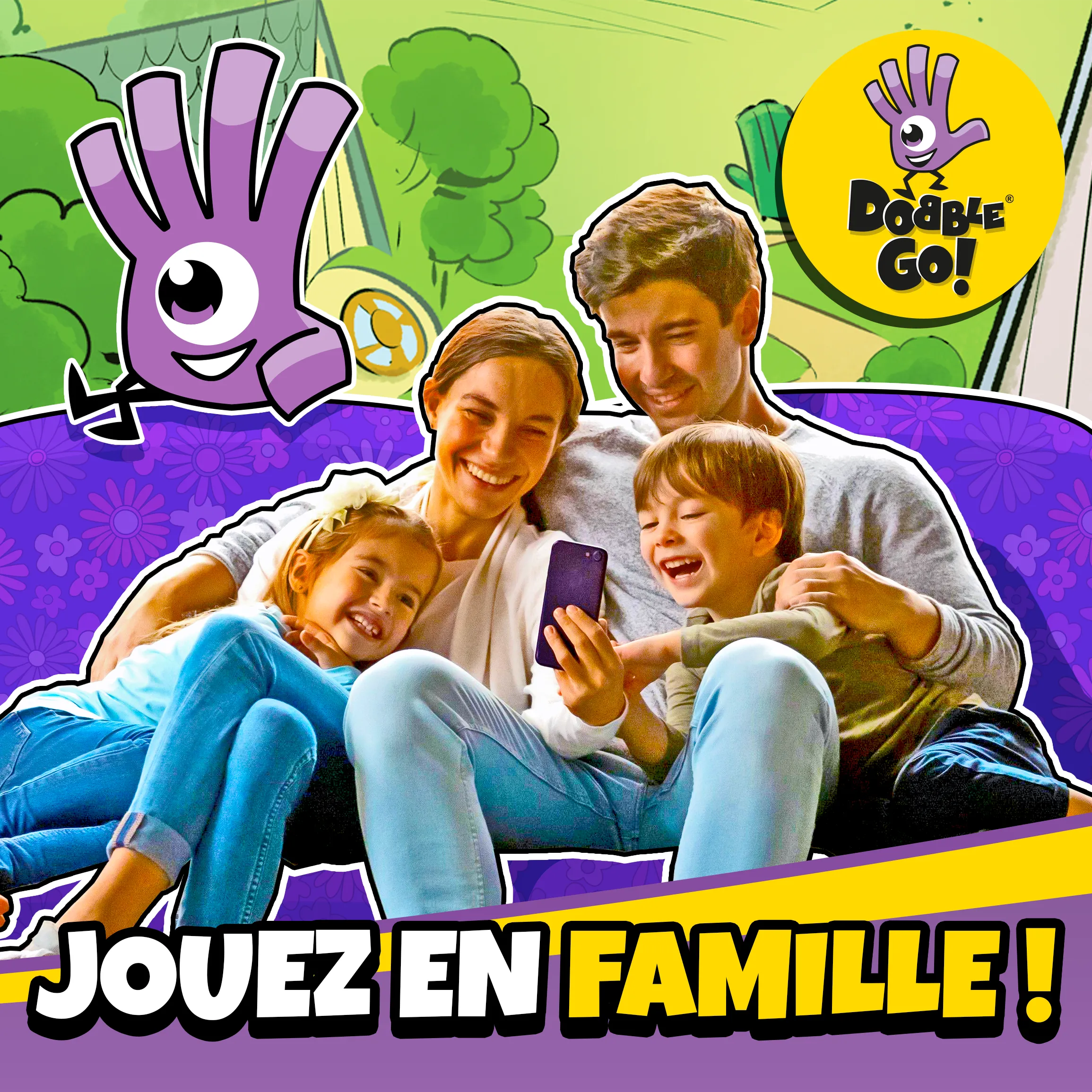
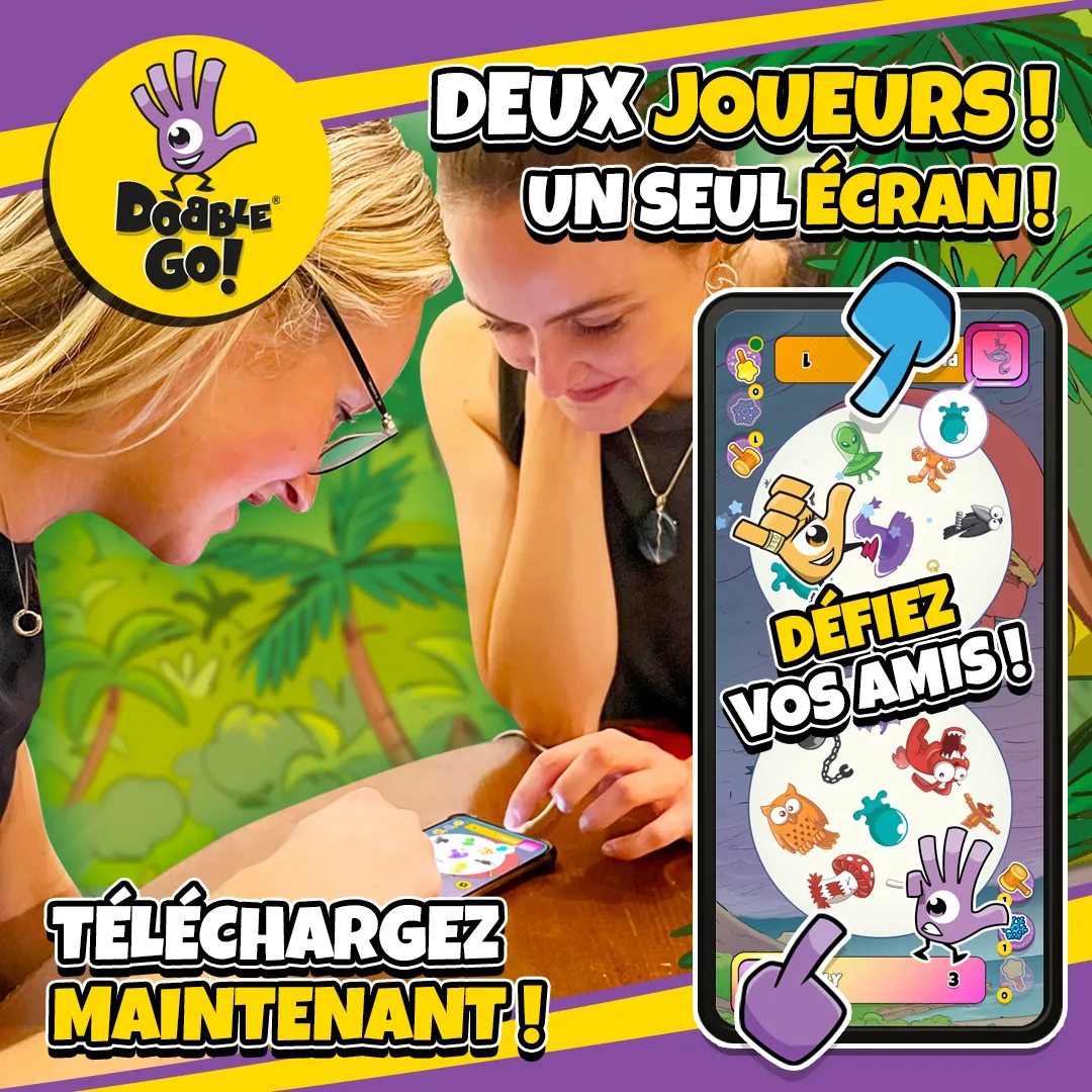
Localised variants — German, French, and Spanish. Same layout, adapted for each market.
Seasonal content
I designed UI and assets for seasonal events, including limited-time content and themed updates for holidays such as Christmas and Easter. These updates play a key role in maintaining player engagement — requiring designs that feel distinct while still fitting seamlessly within the existing Dobble aesthetic.
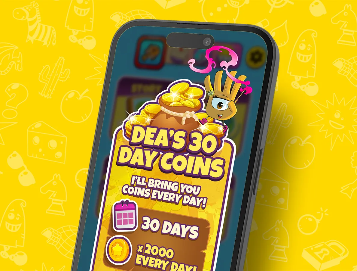
Daily coins UI — seasonal reward screen designed for the Easter event.

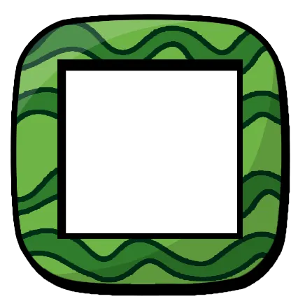

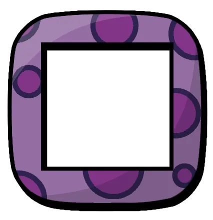


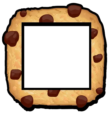
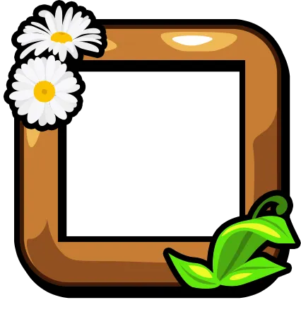
Easter seasonal borders — six limited-time collectibles.
Illustration
For seasonal events I created new sets of Dobble icons in Photoshop. Each symbol needed to be:
- Instantly recognisable at small sizes
- Visually distinct from others in the set
- Cohesive within a themed collection
Given the speed of gameplay, clarity wasn't something you could sacrifice — every icon had to communicate immediately.


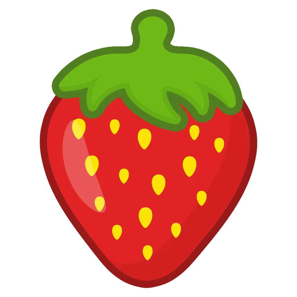


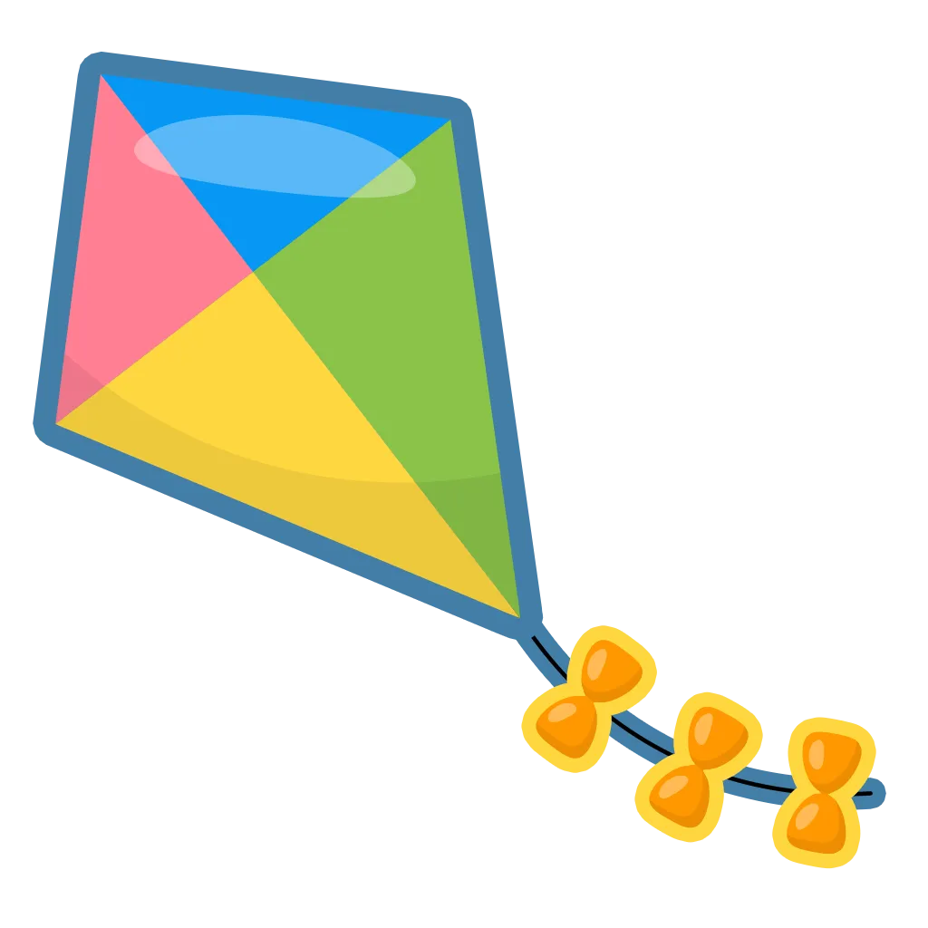


Easter icon set — 24 symbols illustrated for a new seasonal Dobble pack.


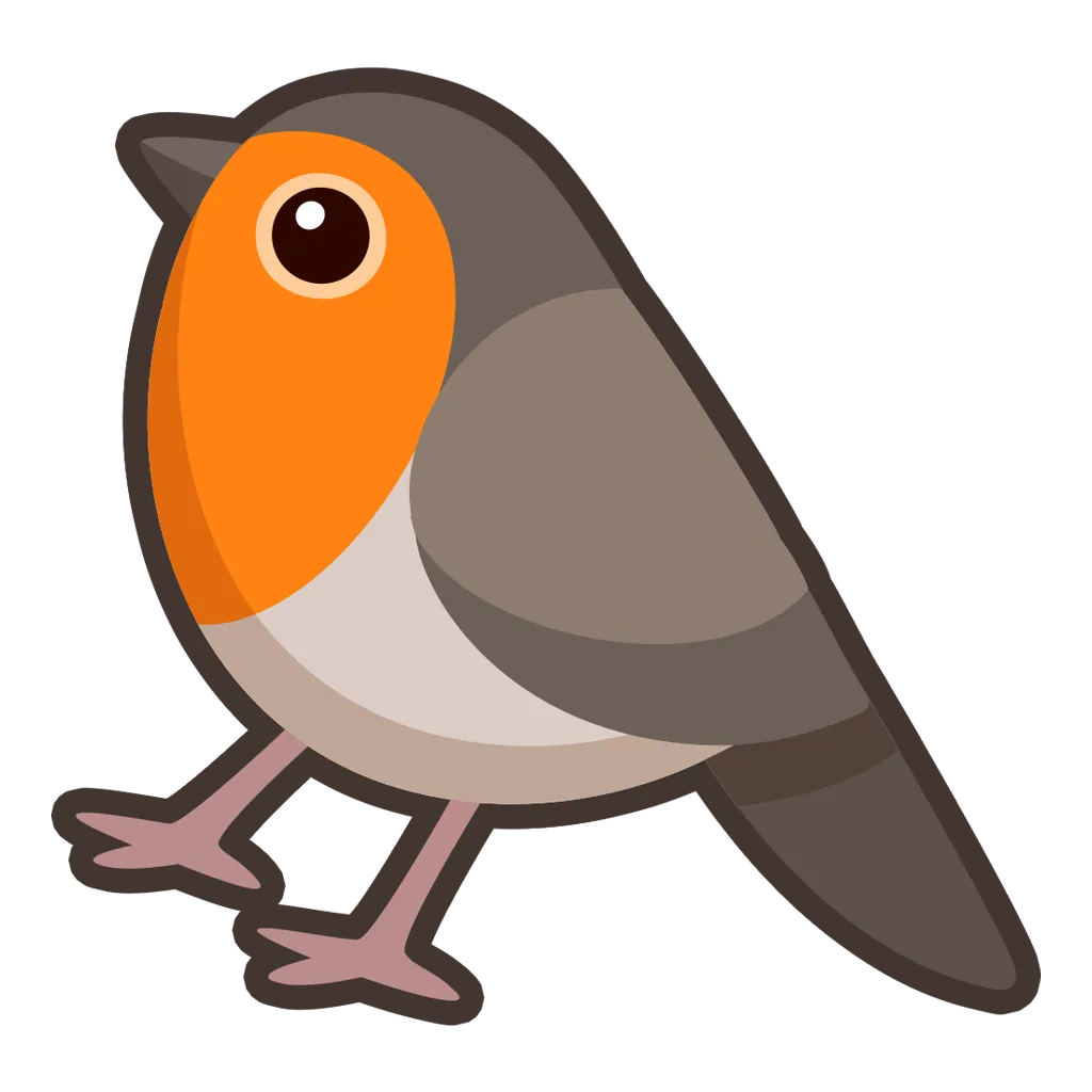


Christmas icon set — 24 symbols for a festive seasonal Dobble pack.
What I took away
Working on a live product meant designing for real use, not ideal scenarios. Seeing my work ship and function at scale was both challenging and rewarding.
This project introduced me to the realities of professional UI design: systems over one-offs, flexibility over perfection, and decisions shaped by real constraints.
App start screen — the entry point players see every session.
Bibliography
- ---
- ---
- ---