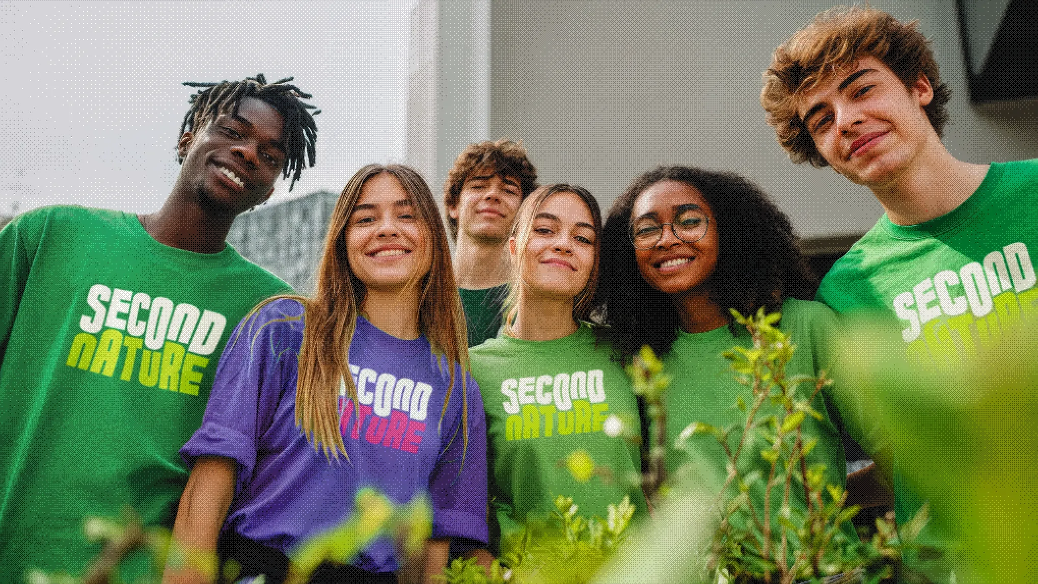
Second Nature — the finished brand in application.
A speculative branding project exploring how design could be reshaped in a post-growth future. I developed Second Nature as part of a Post-Growth brief — asking us to imagine futures where economic growth is no longer the primary goal of society, and to explore what graphic design might look like inside them.
Research
The brief had two phases: four weeks of collaborative research in a group, then an individual brand development stage where I took our research direction and built a complete visual identity from scratch.
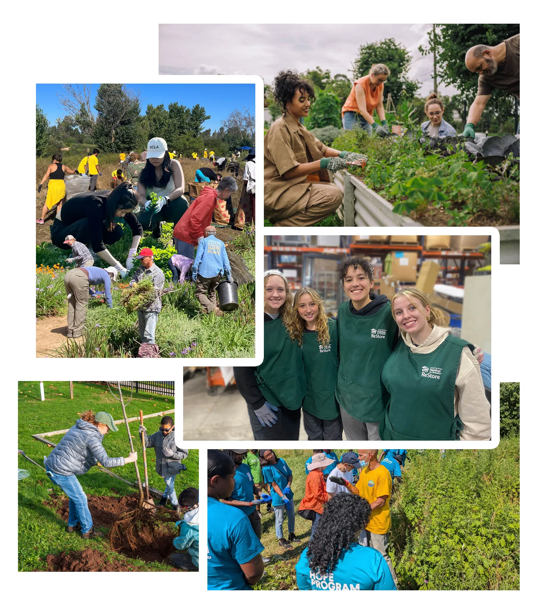
On the first day, each group was assigned a random topic to explore through a Post-Growth lens. Ours was concrete. It sounds like a dull draw — but the more we looked at it, the more interesting it became. Concrete is the most widely used construction material on the planet, and a huge proportion of it is crumbling, stained, and past its best. Cities built fast, not built to last.
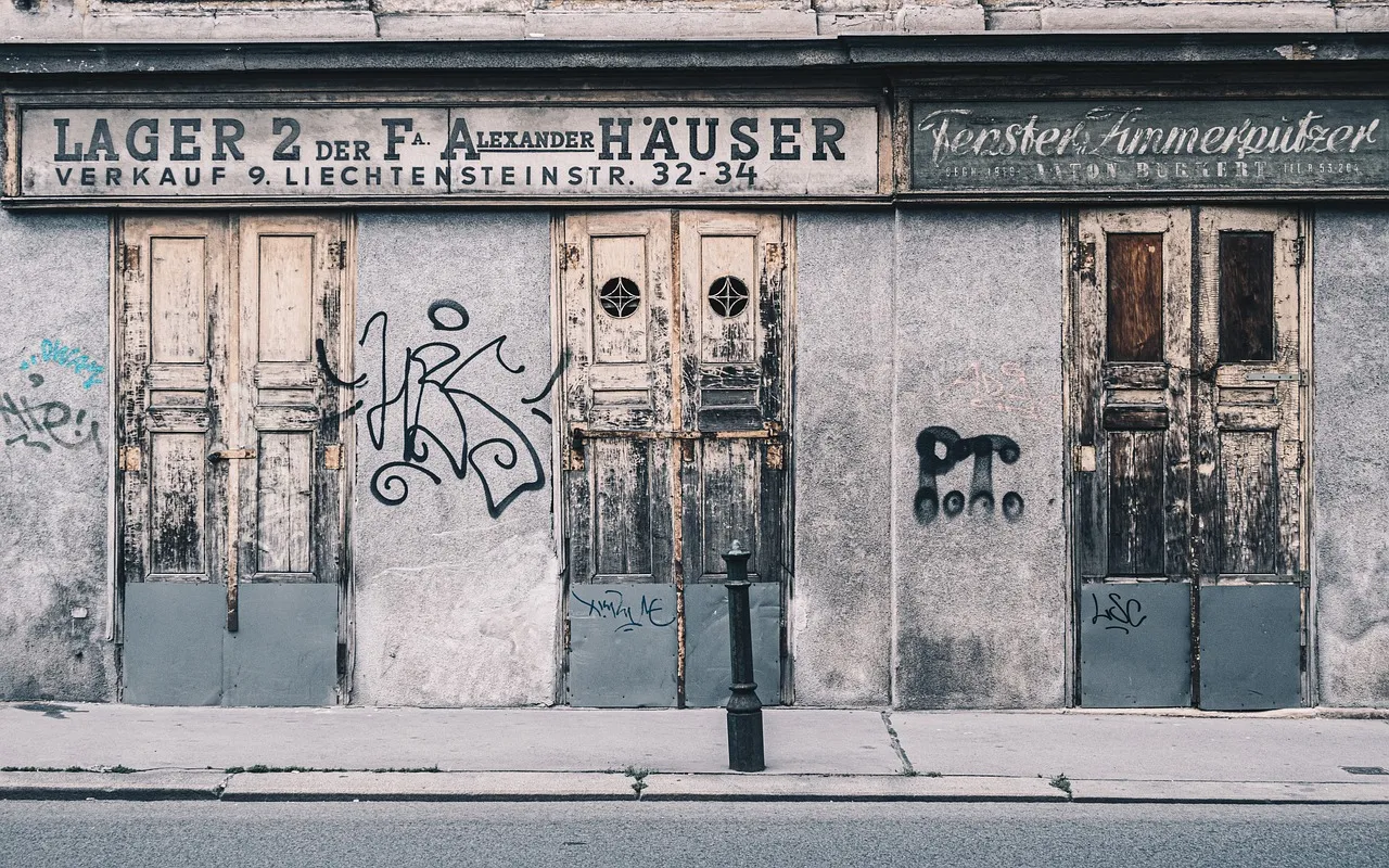
Research imagery — the built environment and its material decay.
The spark
During the research phase I came across something that would elevate the project. Kintsugi is the Japanese art of repairing broken pottery with gold, treating the damage as part of the object's history rather than something to be hidden. The cracks become the most beautiful part.
I started thinking about what that would look like applied to concrete. Instead of hiding the decay, you fill the cracks with something alive — with nature as the gold. The degradation becomes a starting point rather than an endpoint.
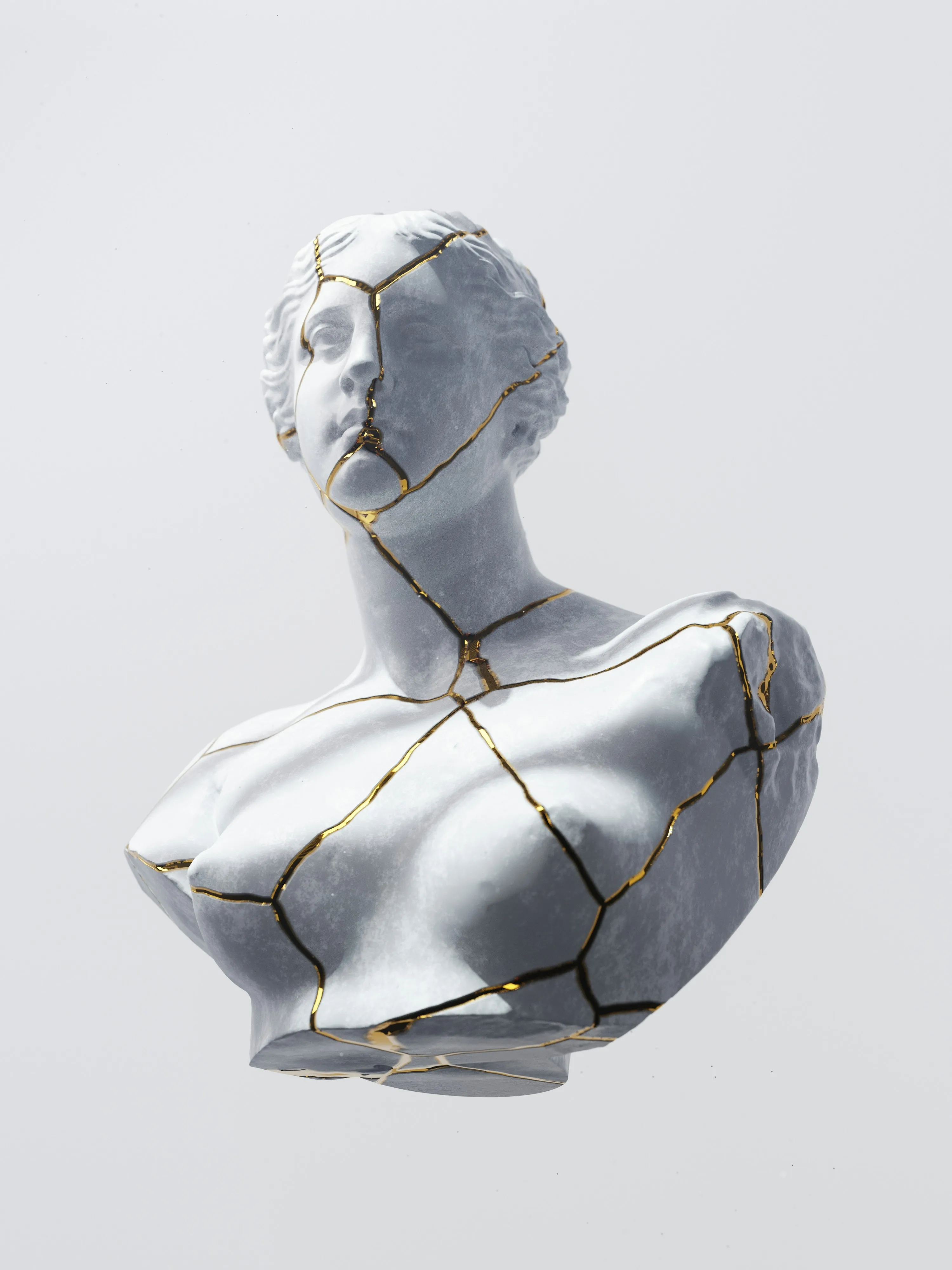
Kintsugi reference (left) — the principle of making damage beautiful informed the entire concept.
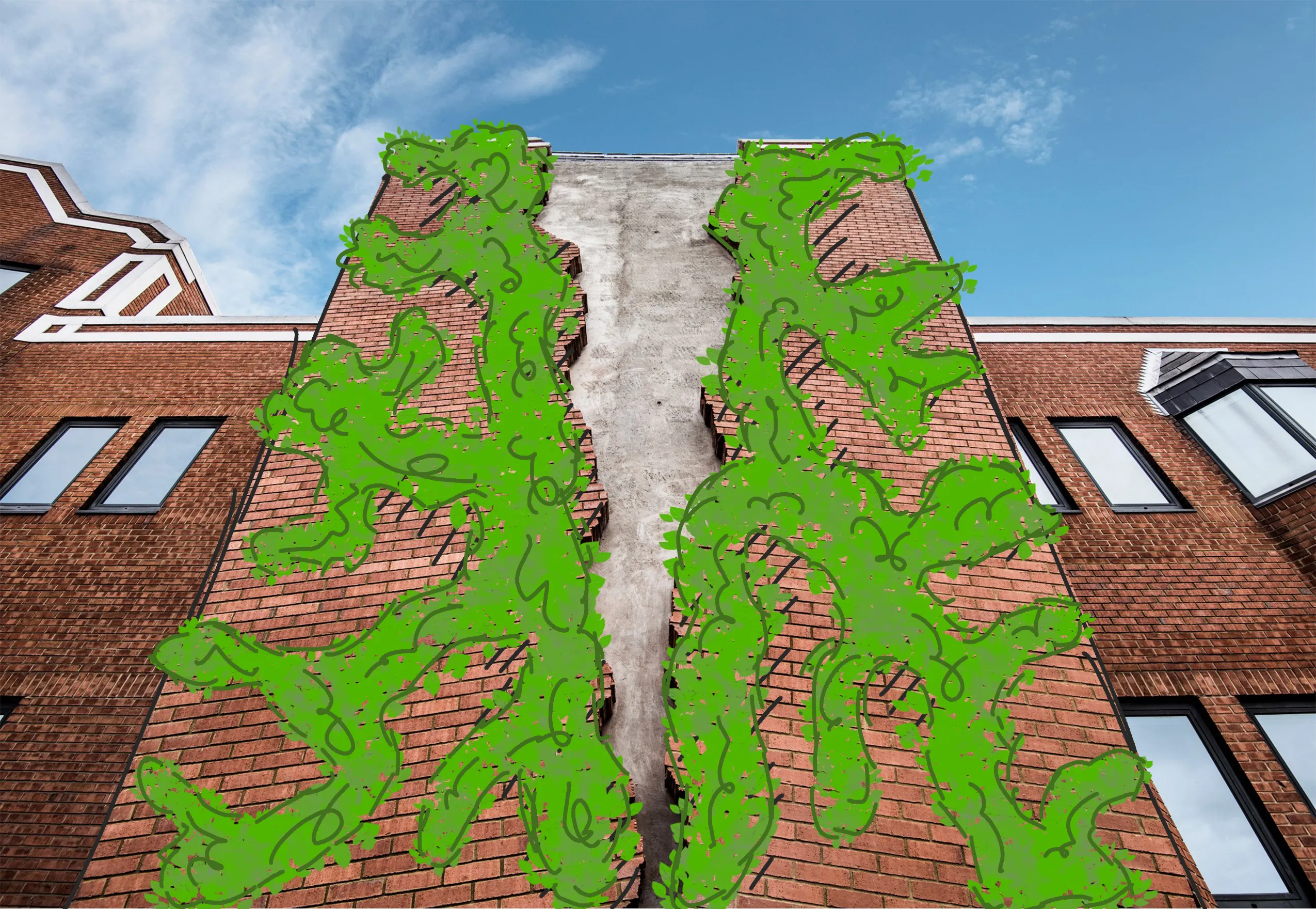
I led the group toward a concept built around green living walls — reclaiming and revitalising deteriorating concrete structures with nature rather than demolishing or ignoring them.
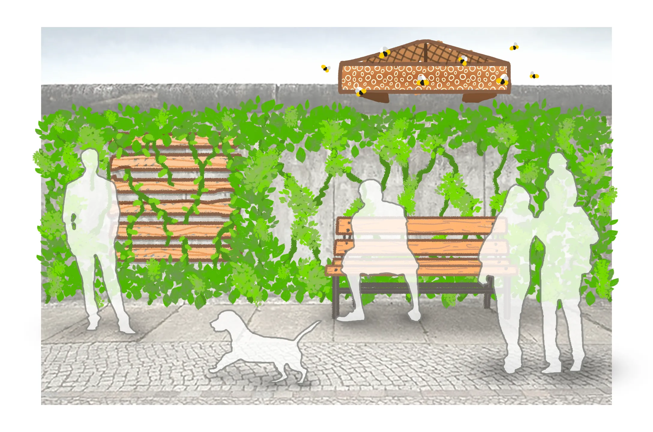
Concept development — community profiles and early green wall studies.
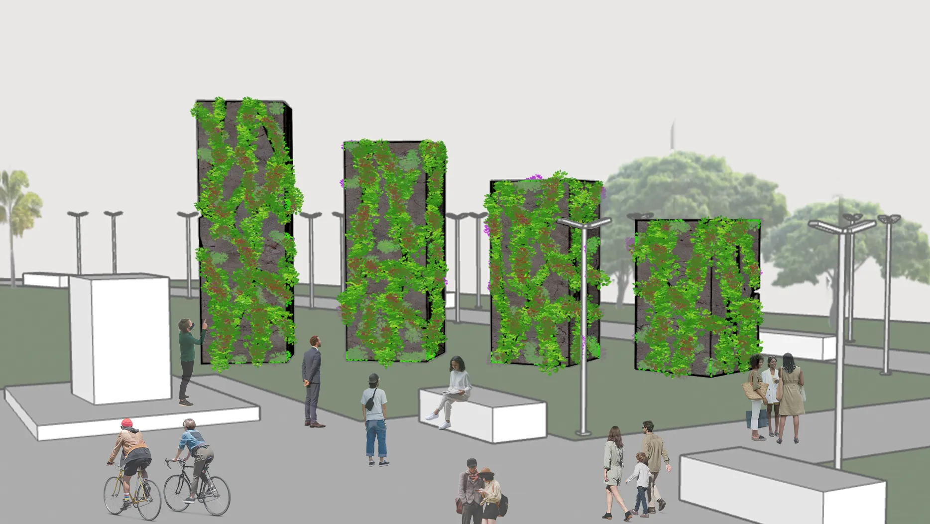
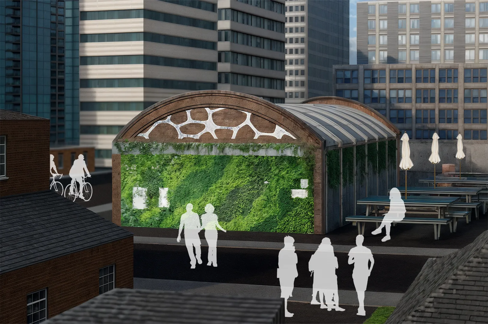
3D visualisations — nature reclaiming concrete structures.
The brand
Second Nature is the fictional non-profit I built from that idea: an organisation that helps urban communities transform neglected concrete spaces into thriving green environments.
The name carries a double meaning I was delighted with. Nature reclaiming space, but also the idea that this kind of regeneration should feel instinctive. A second nature — something we do without needing to be convinced.
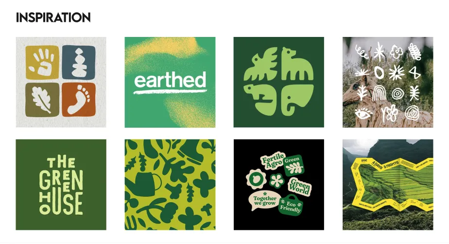
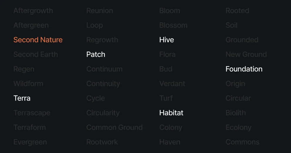
Early brand development — inspiration references and naming explorations.
I kept the palette rooted in nature without leaning into the obvious. Earthy greens and warm neutrals did the heavy lifting across the identity. The cracked logo treatment directly referenced the kintsugi concept — damage made deliberate and beautiful.
Logo variations — the cracked treatment as a core visual device.
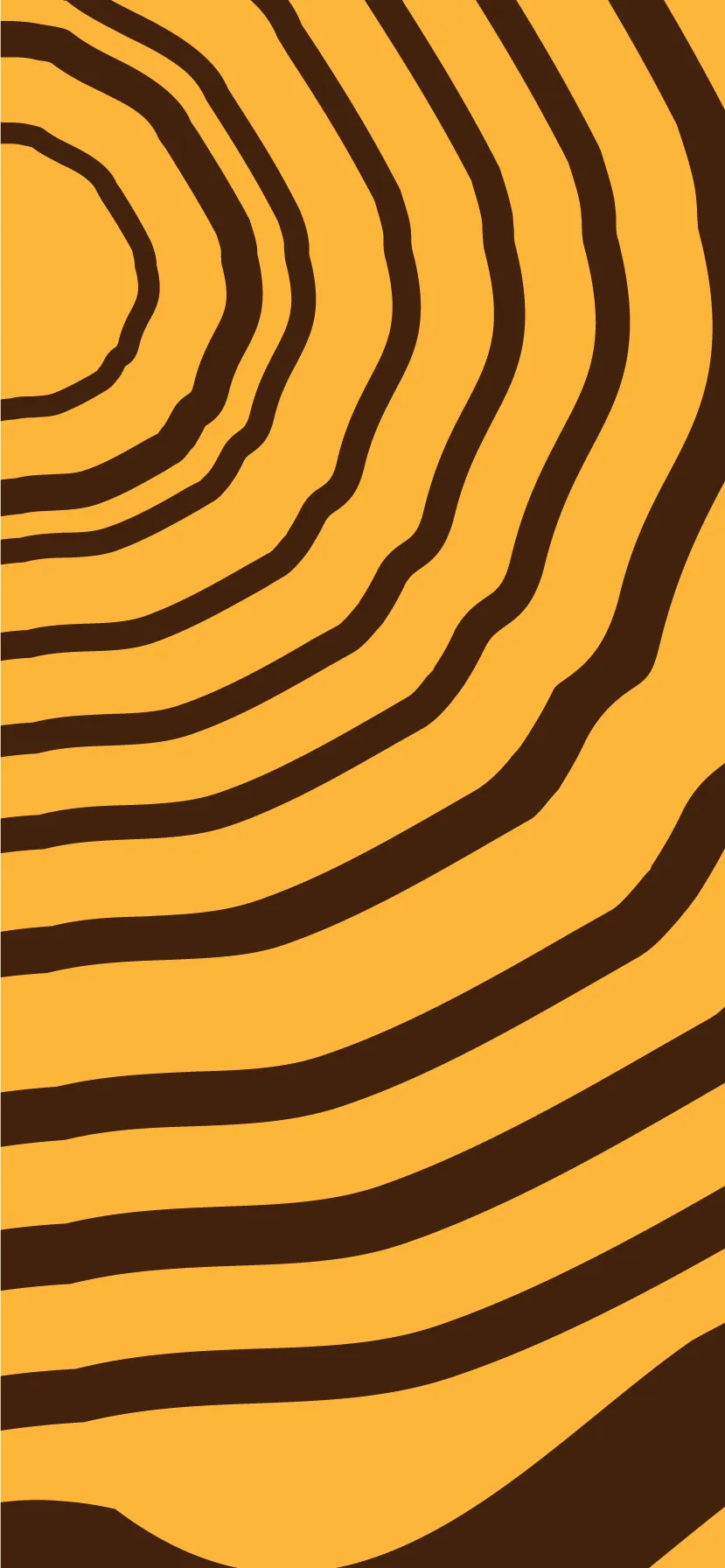
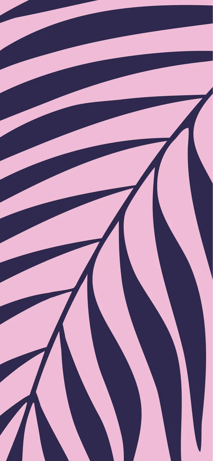
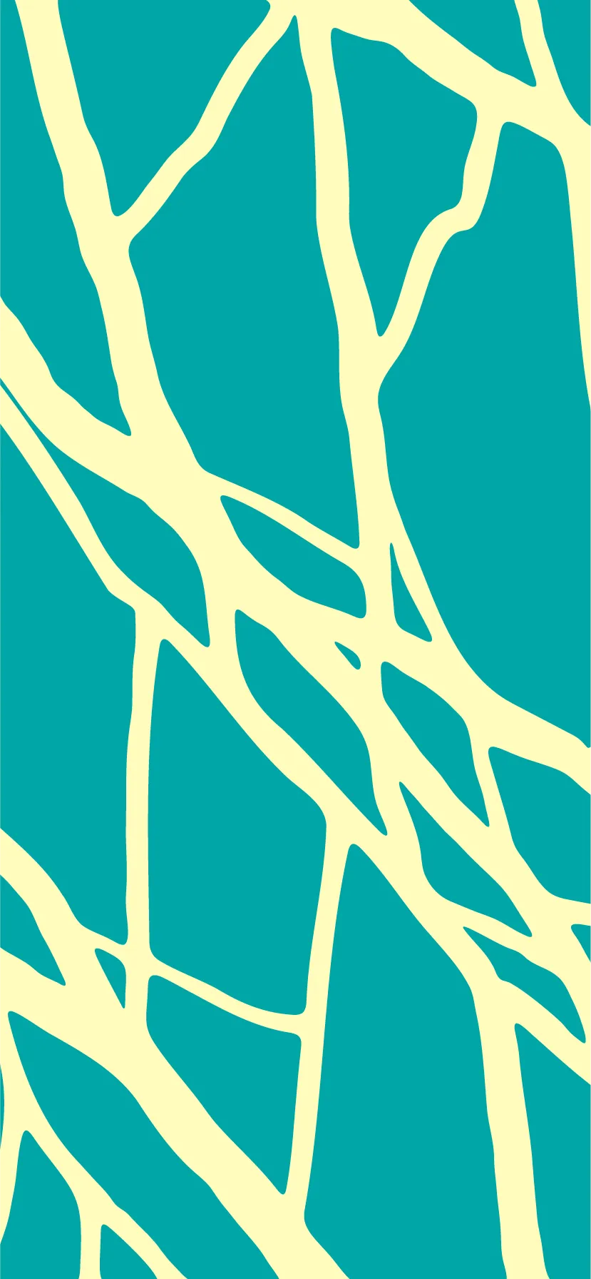

Repeating pattern system — four variations built from the brand's core motifs.
Icon set — supporting symbols for wayfinding, community messaging, and campaign assets.
Brand colour palette — five core tones used across the Second Nature identity.
Typeface scaling. Robson anchors the logo, Soria handles headings, and Asap Condensed supports body copy.
Design philosophy
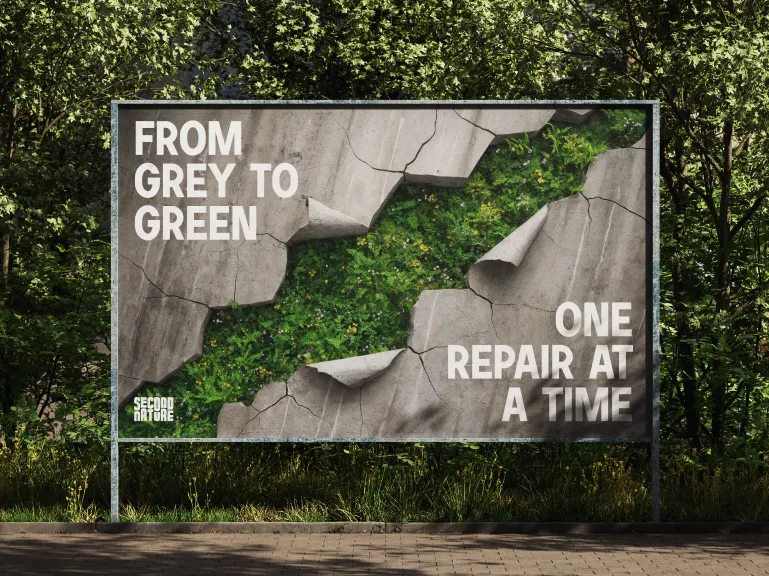
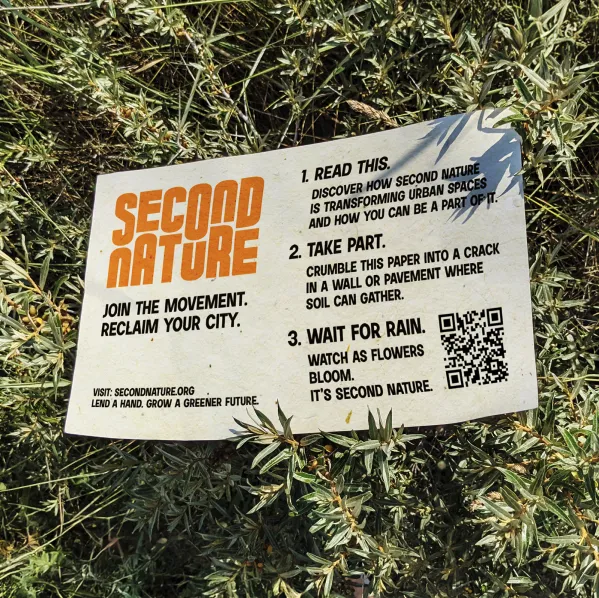
The marketing had to do what the brand preaches. I mocked up the Second Nature logo in unconventional contexts — grown from moss, spray-painted onto crumbling concrete walls in biodegradable paint. The idea was that the advertising itself becomes part of the process. It's not just promoting a movement about healing urban spaces; it's physically participating in it. The medium is the message.
Mockups
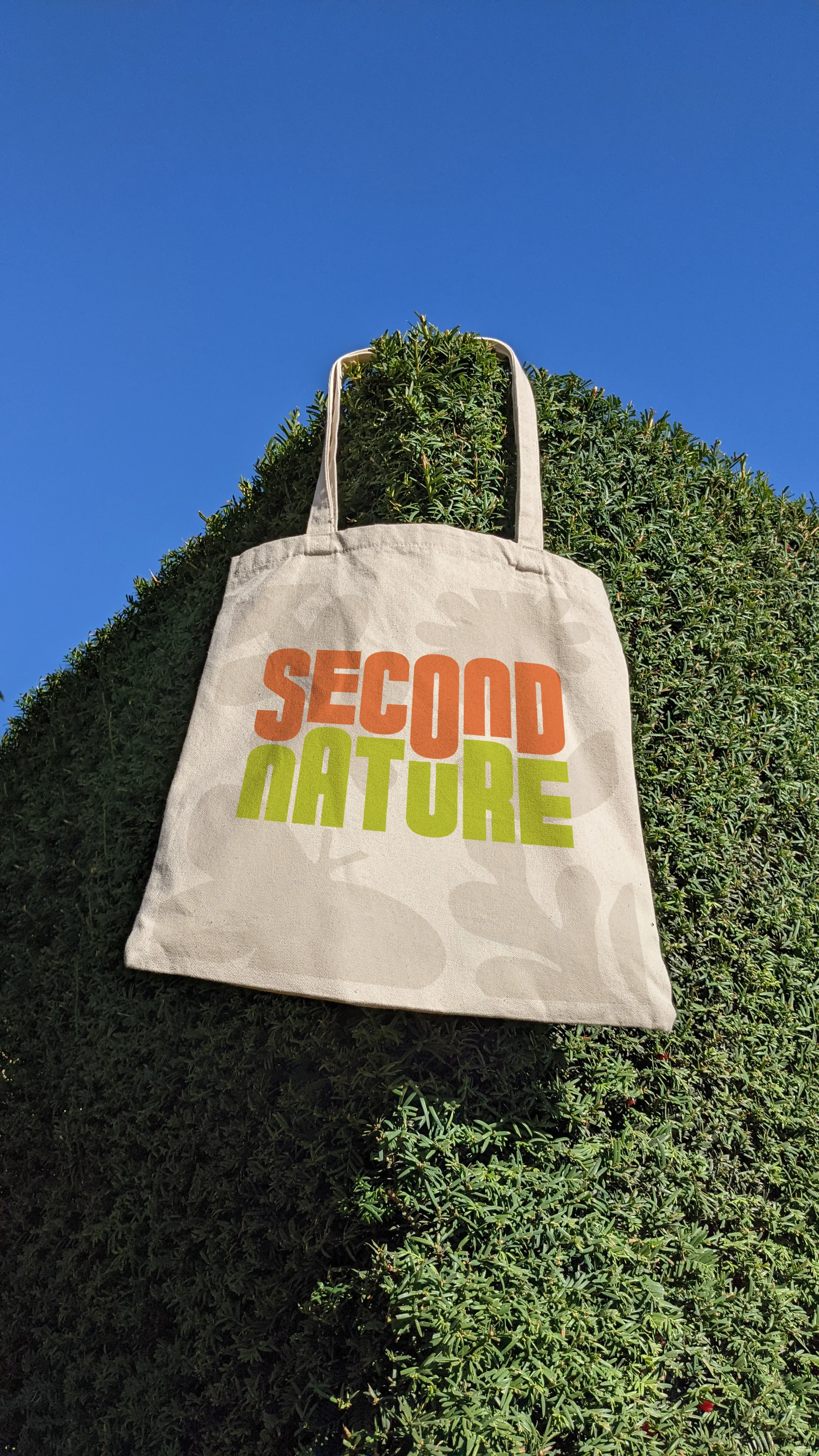
Brand in environment — spray-painted concrete, moss-grown logo, and tote bag mockup.
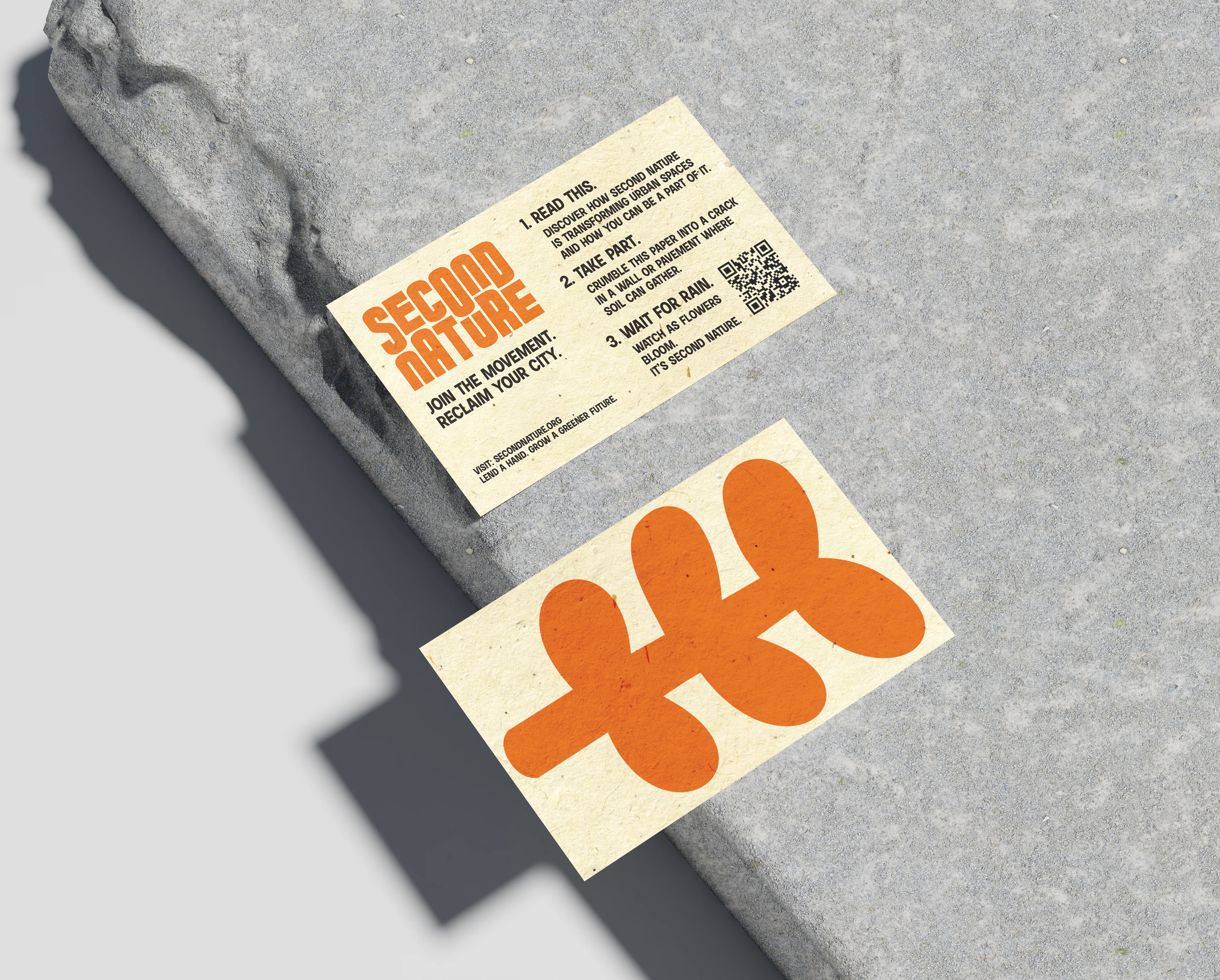
Business card mockups.
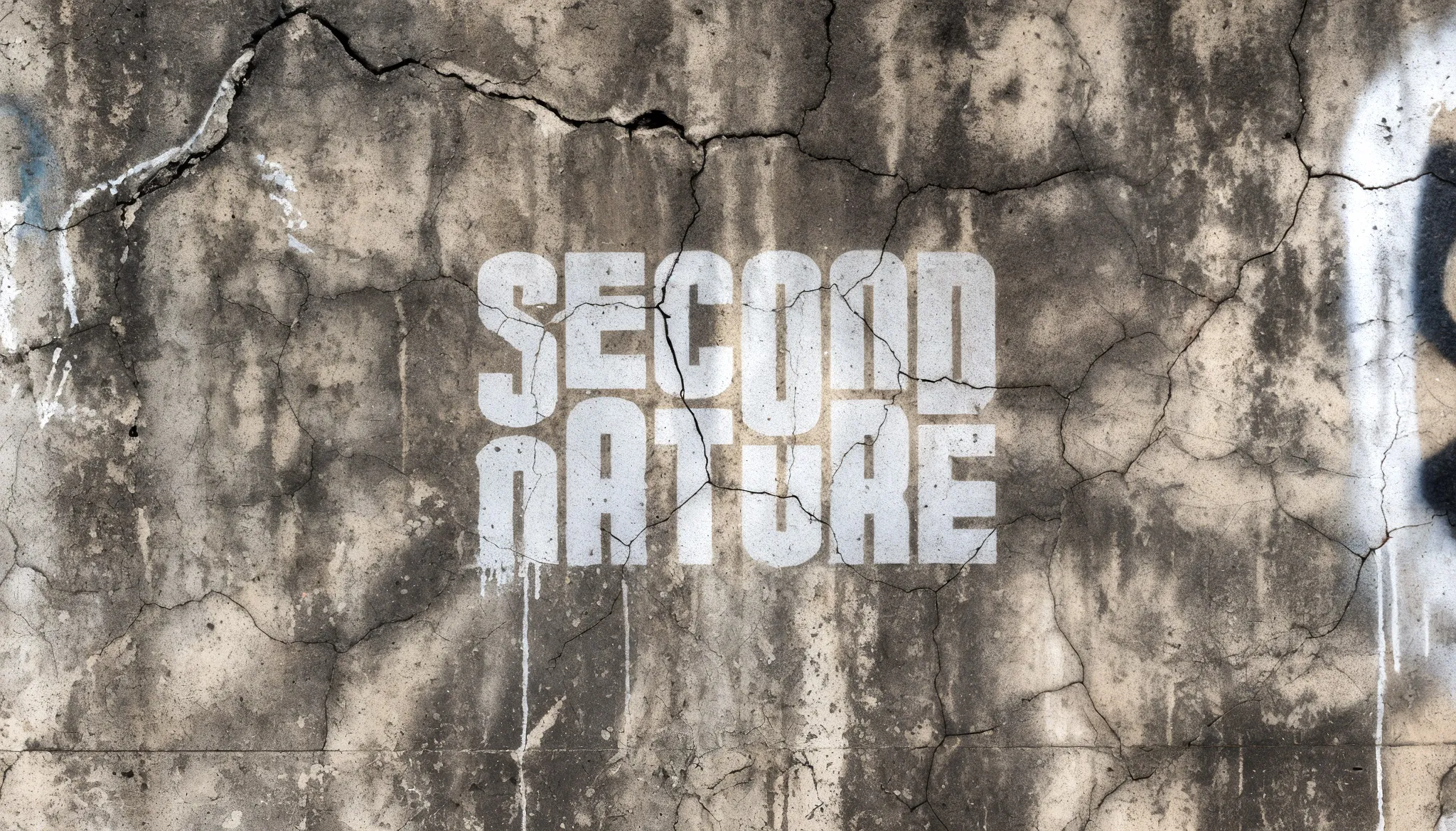
Logo rendered in concrete — the brand's material language made literal.
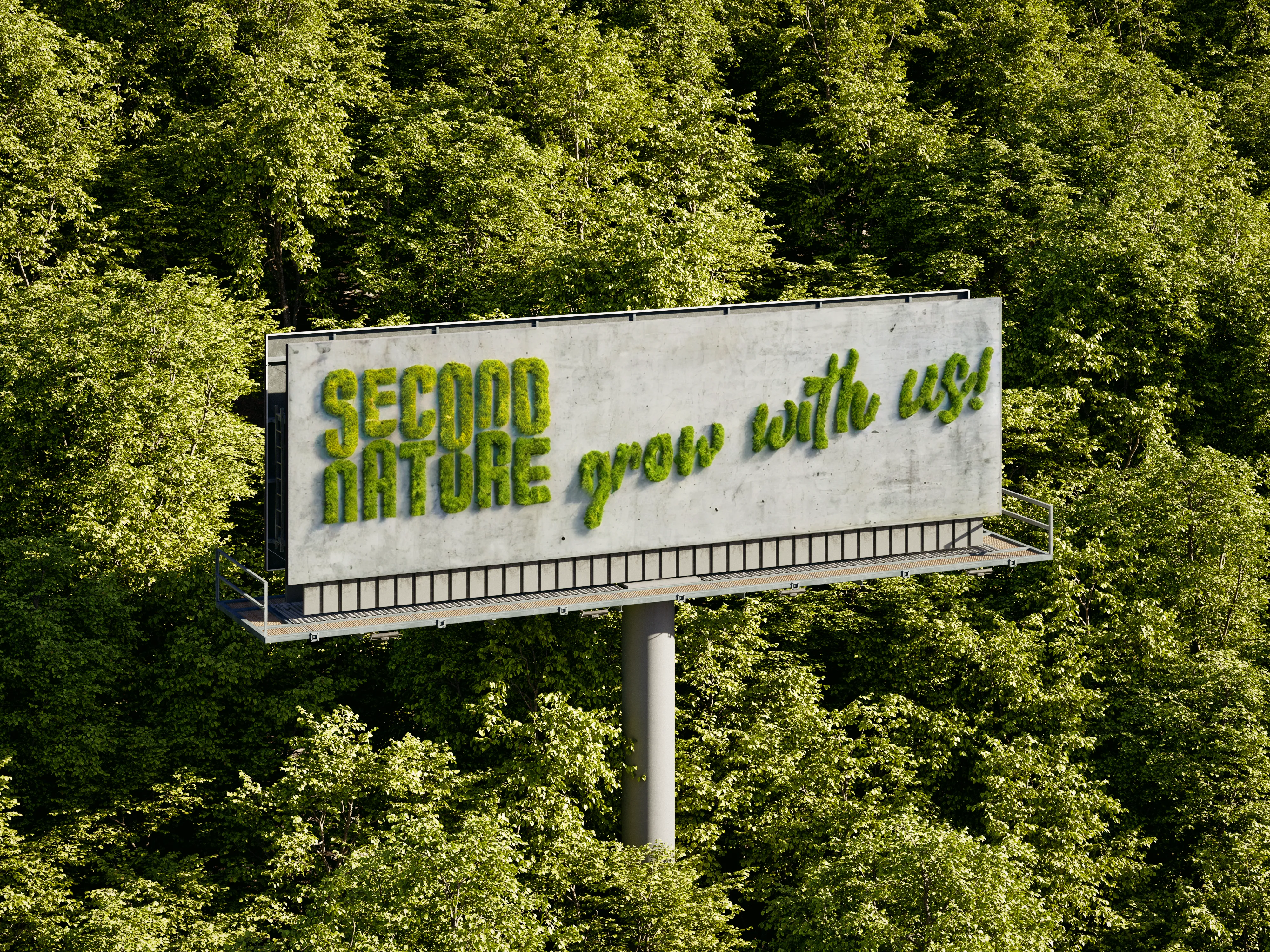
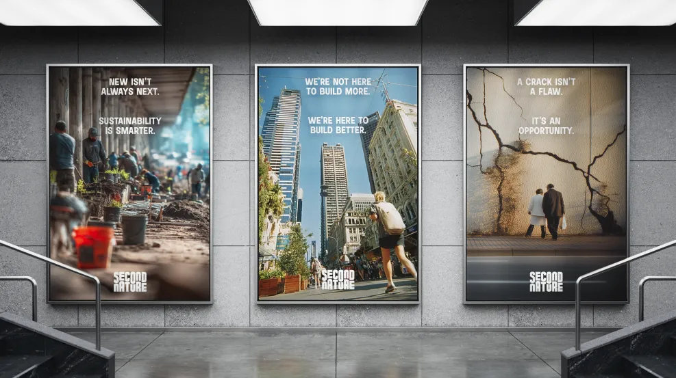
Out-of-home advertising — moss billboard and subway placements.
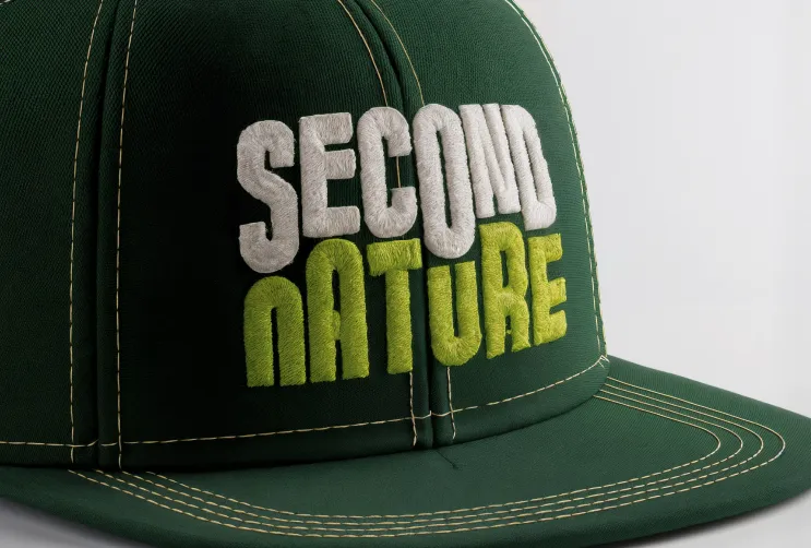
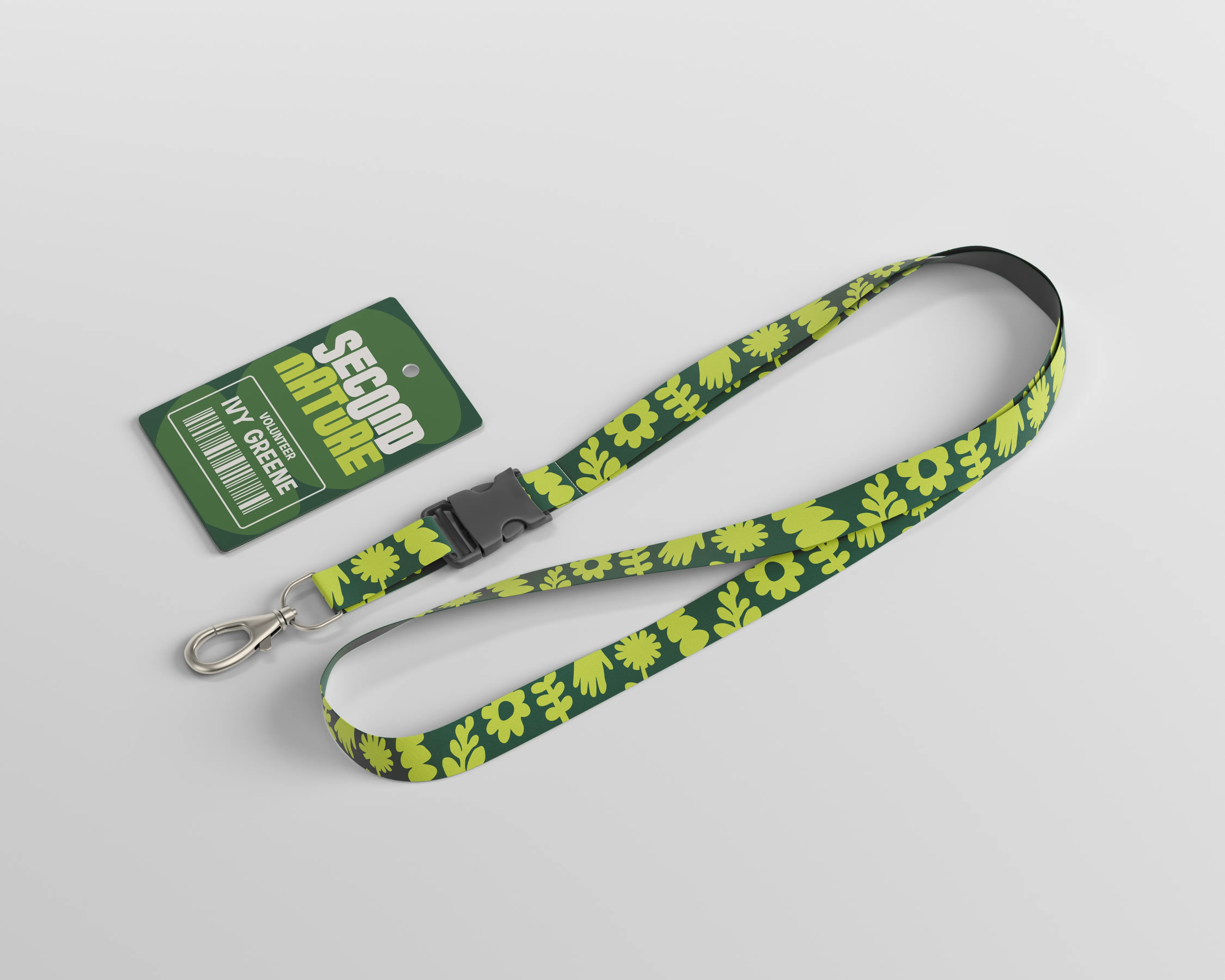
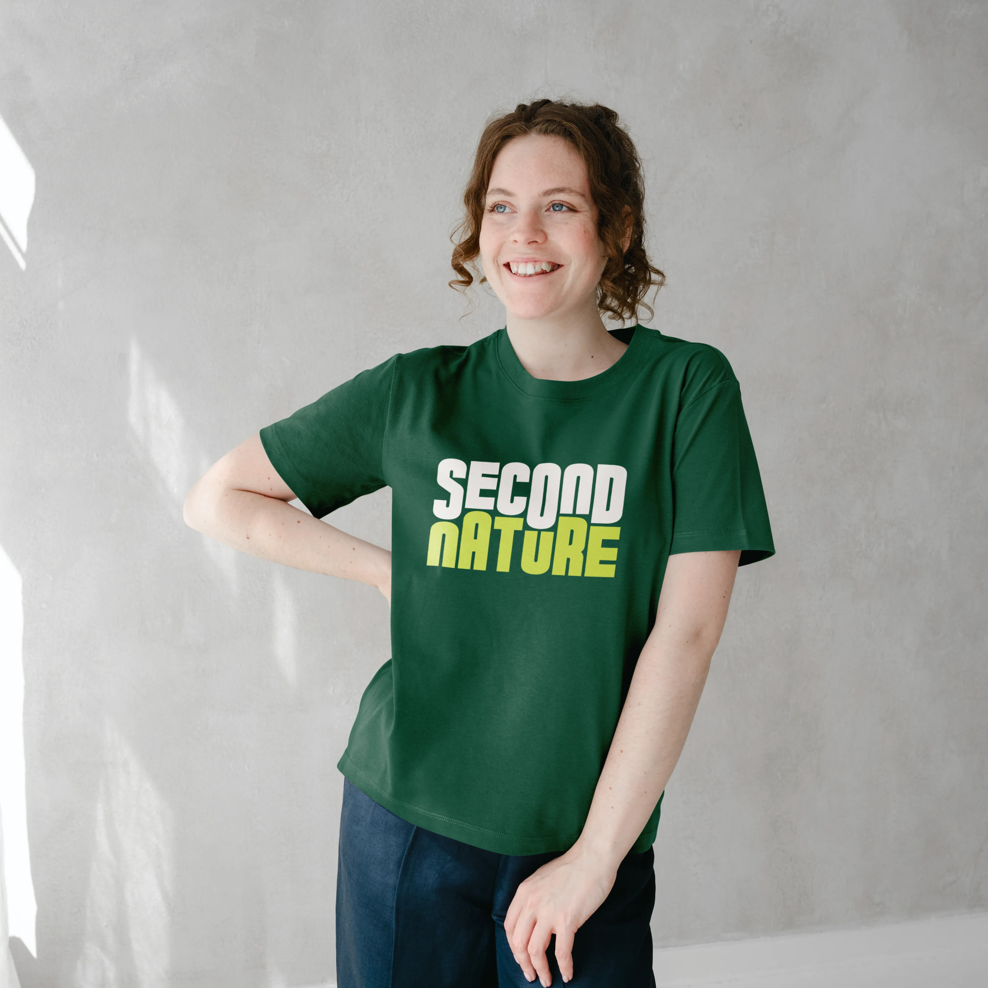
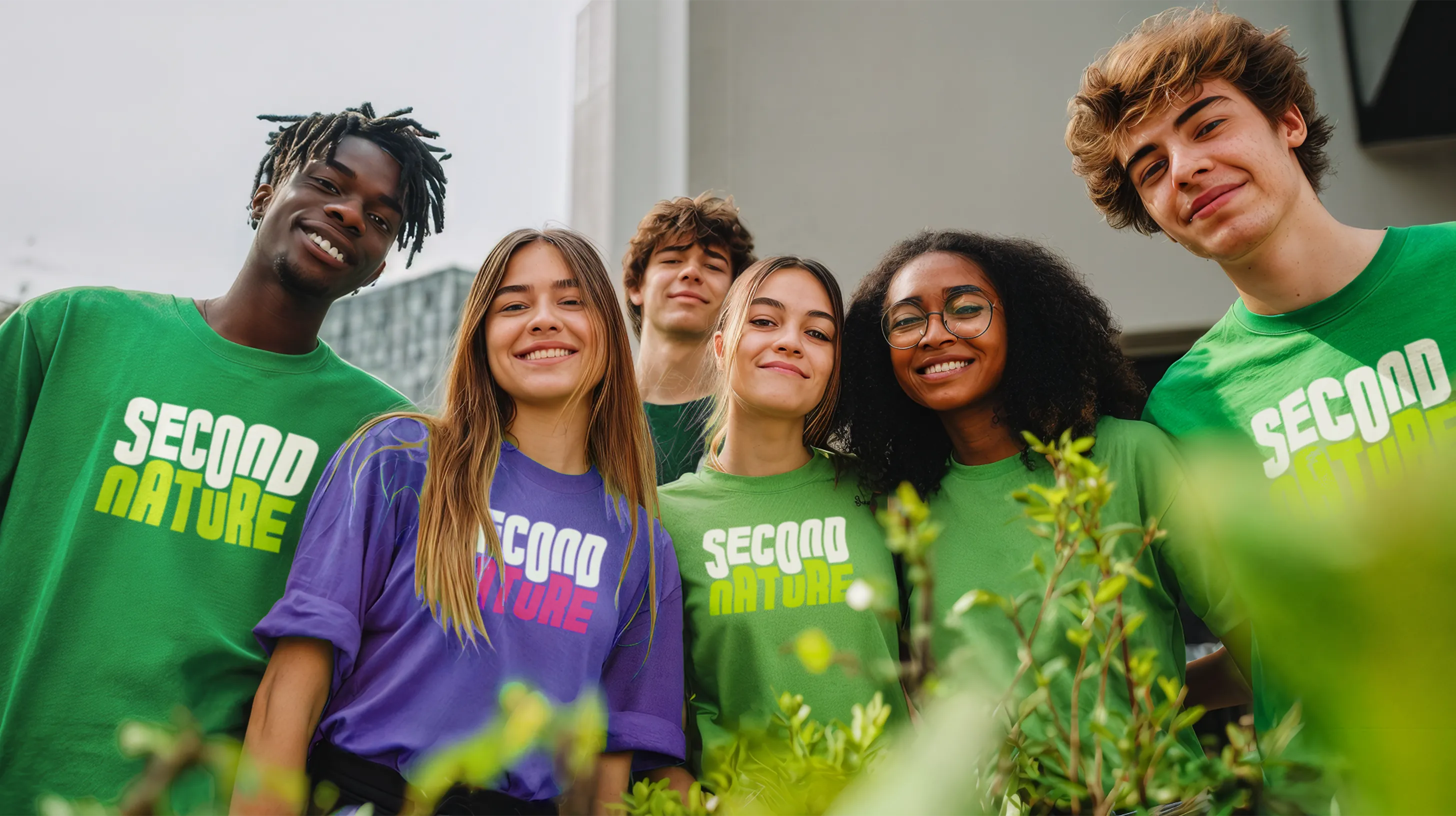
Merchandise — hat, lanyard, and t-shirt mockups.
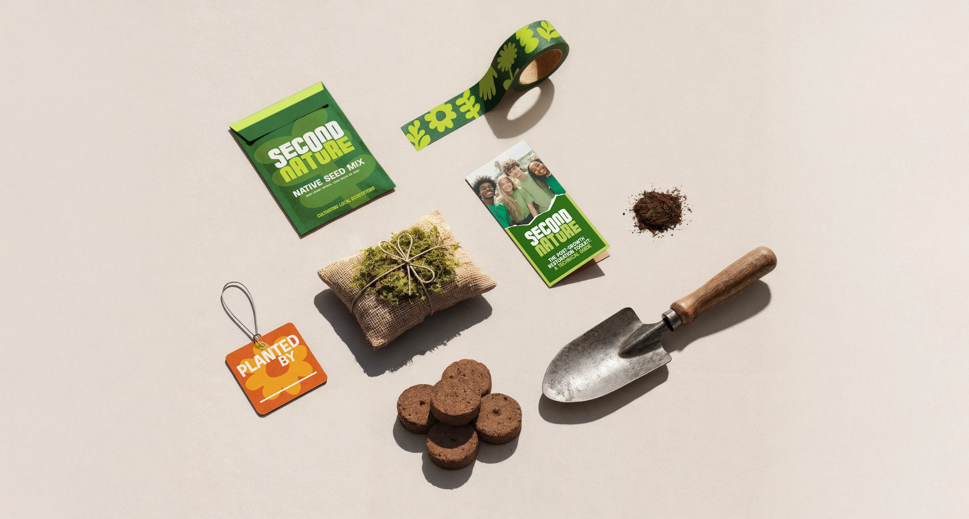
Brand toolkit — the complete system laid out for presentation.
What I learned
The concept drove every decision. This project showed me more clearly than any other the difference between designing with a strong idea behind you and designing without one. When the concept is right, each choice has something to be tested against.
Never write off an idea. What began as a topic I struggled to connect with ultimately became one of the most rewarding projects I've worked on. The brief forced me to look deeper for meaning and direction than I otherwise would have.
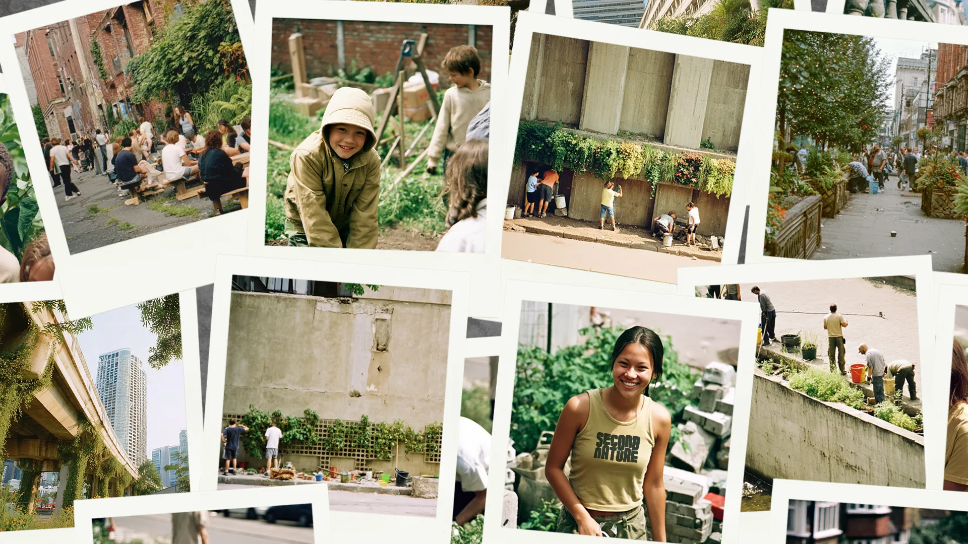
Final polaroid collection — a fitting format for a brand about things that grow slowly.
Bibliography
- ---
- ---
- ---