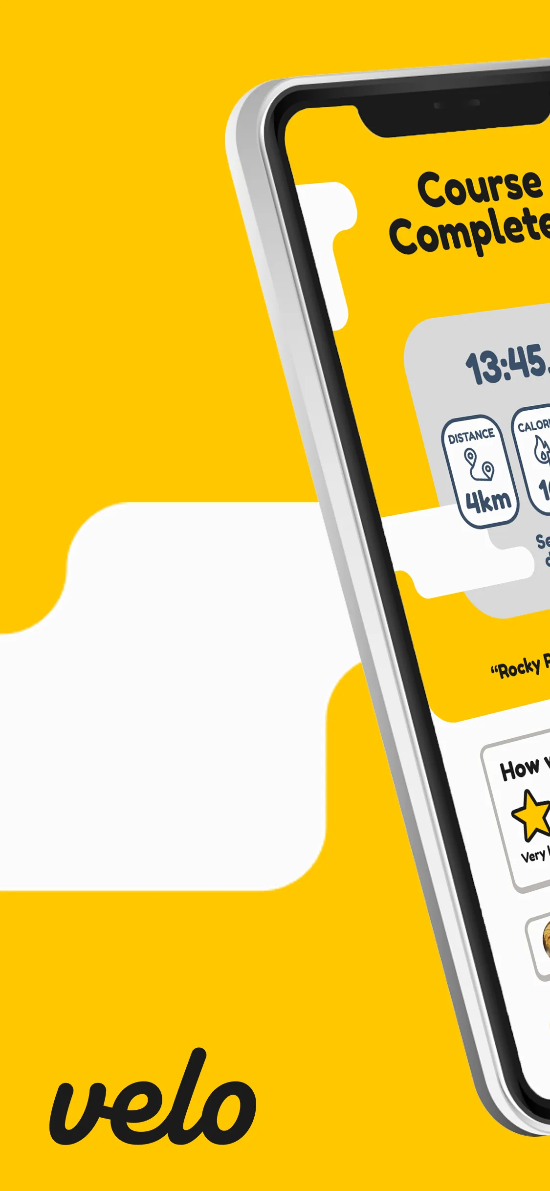
Velo — the finished logo mark.
Velo was my first serious attempt at designing an app from scratch — entirely solo. The brief was self-imposed: design a cycling and fitness tracking app, including the brand identity, UI, custom icons, and a full advertising campaign. Everything from the logo to the App Store mockups was done by me.
Research
The starting point was a gap I'd noticed myself. Existing fitness apps felt either too clinical or too complicated. I wanted to design something that felt genuinely fun to use — something that rewarded you for showing up, not just logging data.
Before designing anything, I ran a user survey. I wanted to know what people actually wanted from a fitness app, rather than guessing. The results shaped almost every major decision that followed — covering demographics, preferred devices, feature priorities, and open-ended suggestions.
Two example questions from the survey — ratings from 1 (low interest) to 5 (high interest), 85 respondents.
The data pointed toward social features and gamification. Users weren't just interested in tracking their own progress — they wanted to compare it, share it, and be rewarded for it. An XP levelling system came out ahead of an in-app currency model, which told me people respond better to progression than to points you can spend.
I also studied the competition. Strava, as the main cycling app on the App Store, set a high bar for usability. Duolingo's bouncy, friendly illustration style became a major visual reference — proof that an app could feel approachable and fun without sacrificing clarity.
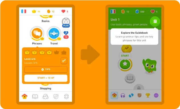
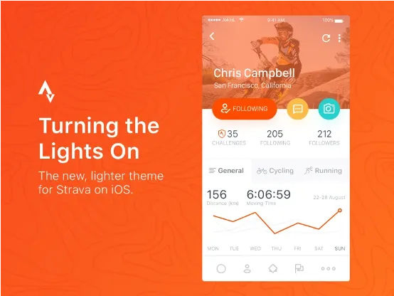
Competitive analysis — Duolingo (visual tone) and Strava (UX benchmark).
Brand identity
Yellow was a deliberate choice. Colour psychology played a real role here — yellow carries an energy and warmth that felt right for an app designed to motivate people. I built the whole palette around it, selecting complementary tones for buttons, text, and interactive elements that kept the interface feeling cohesive.
The typefaces did the same job. Fredoka One for headings — rounded, friendly, immediately characterful. Inria Sans Bold for body text — readable and grounded enough to balance the playfulness of the display font. Together they established a tone that felt welcoming without being childish.
Brand colour palette — built around yellow as the primary motivational hue.
Typeface scaling. Fredoka One was my font of choice for the app.
UI design
Figma was entirely new to me going into this project. Learning the tool and designing a full app inside it simultaneously was a challenge, but it also meant every decision was made from first principles rather than habit. UI components were kept to three consistent variants throughout — all rounded corners, all carrying the same soft and approachable feel. I also rigged up prototypes to test the app on my phone in real time while designing.
Button component states — three variants. Hover or press to see transitions.
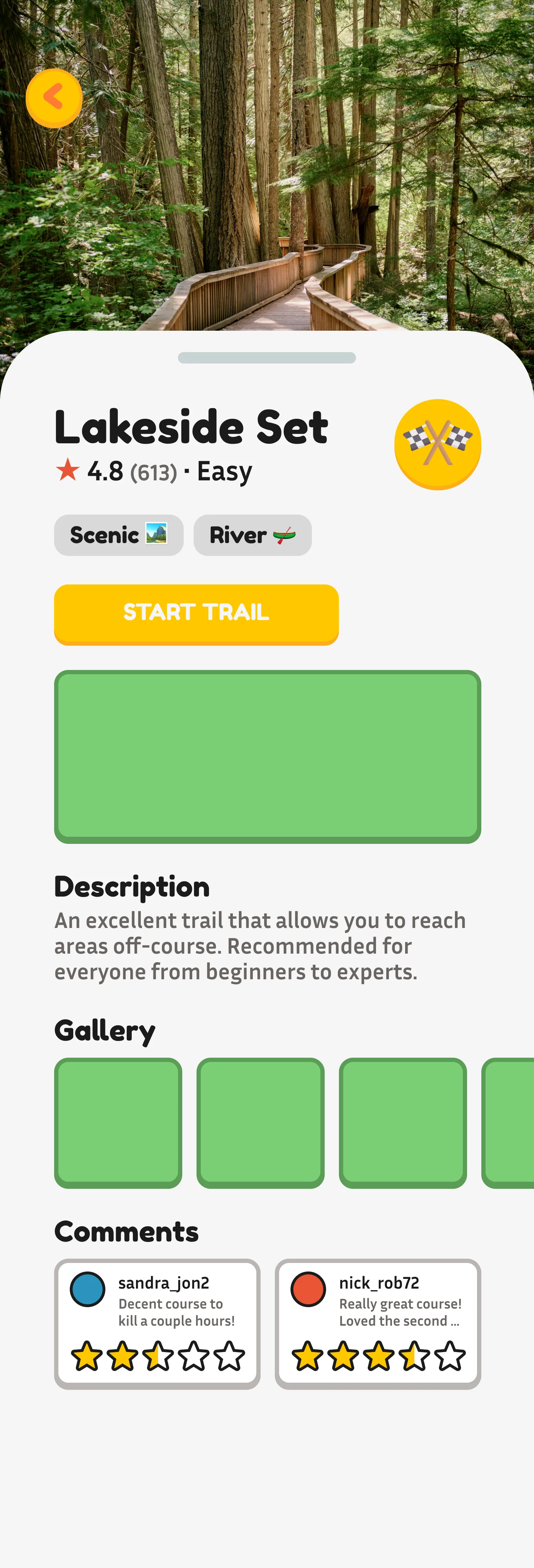
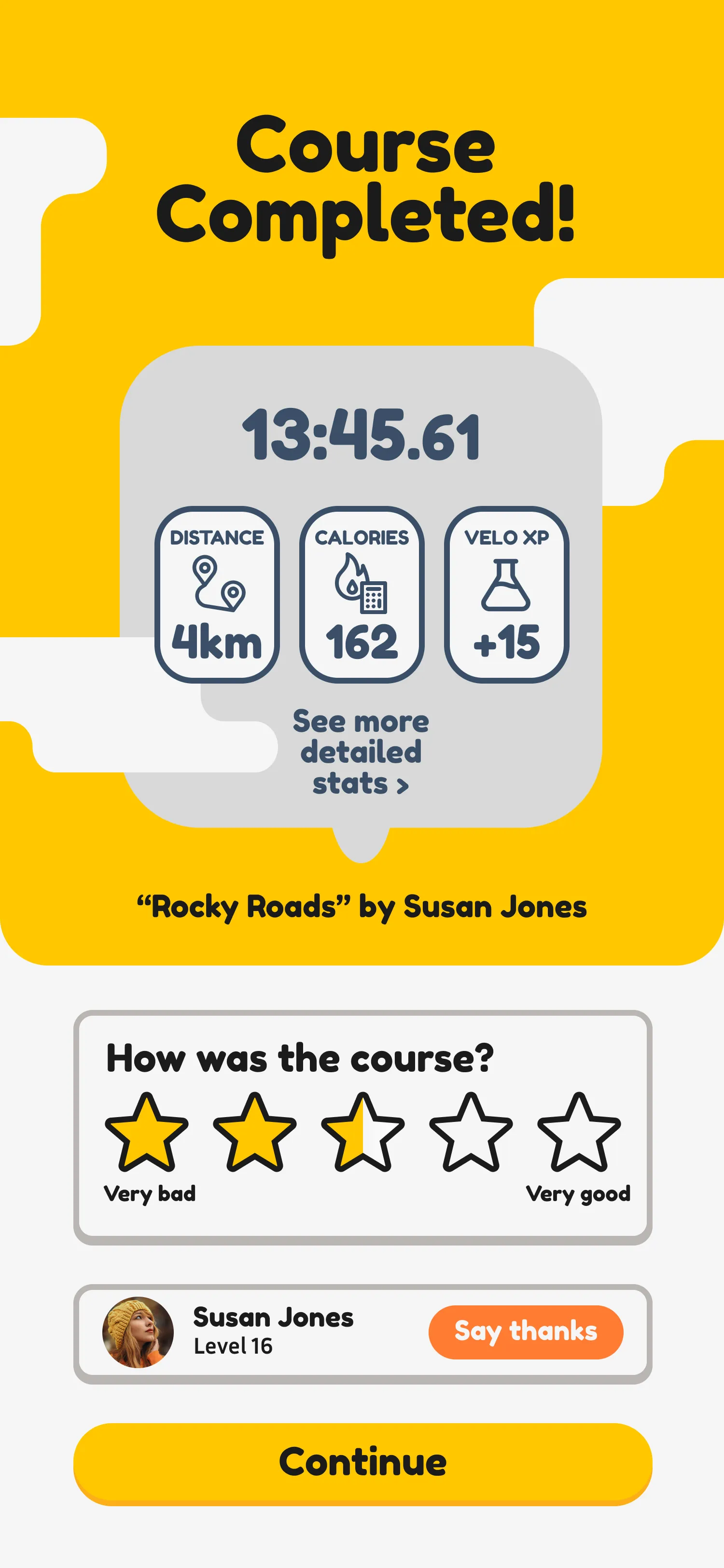
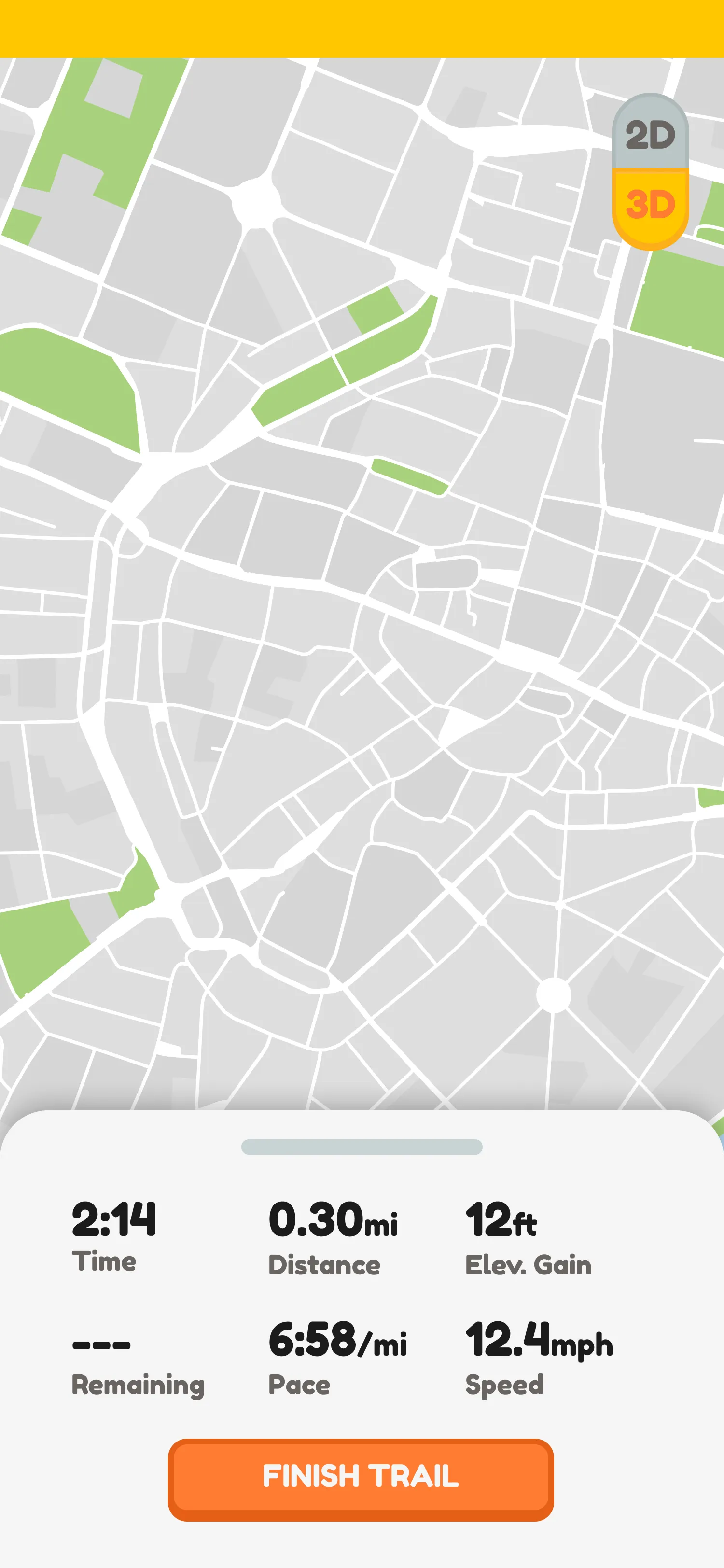
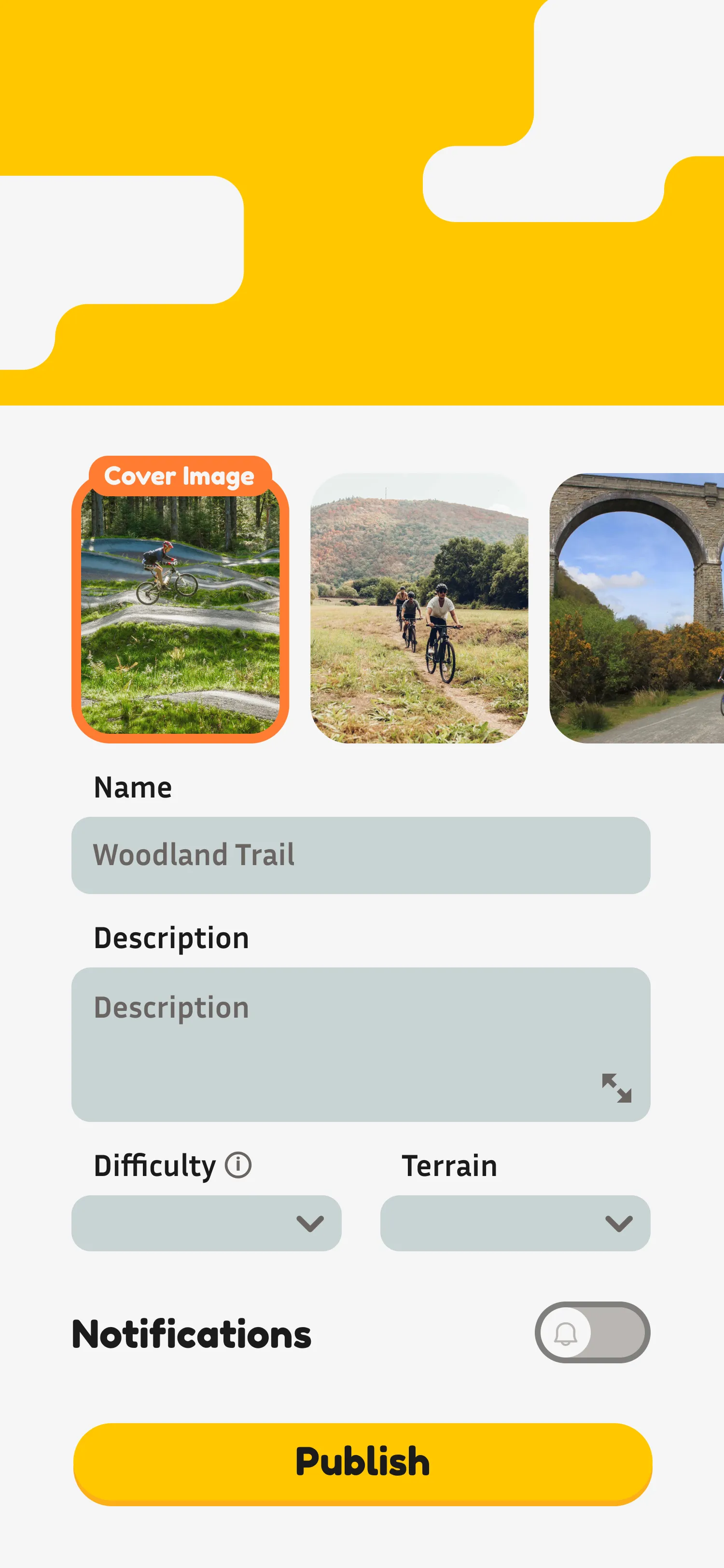
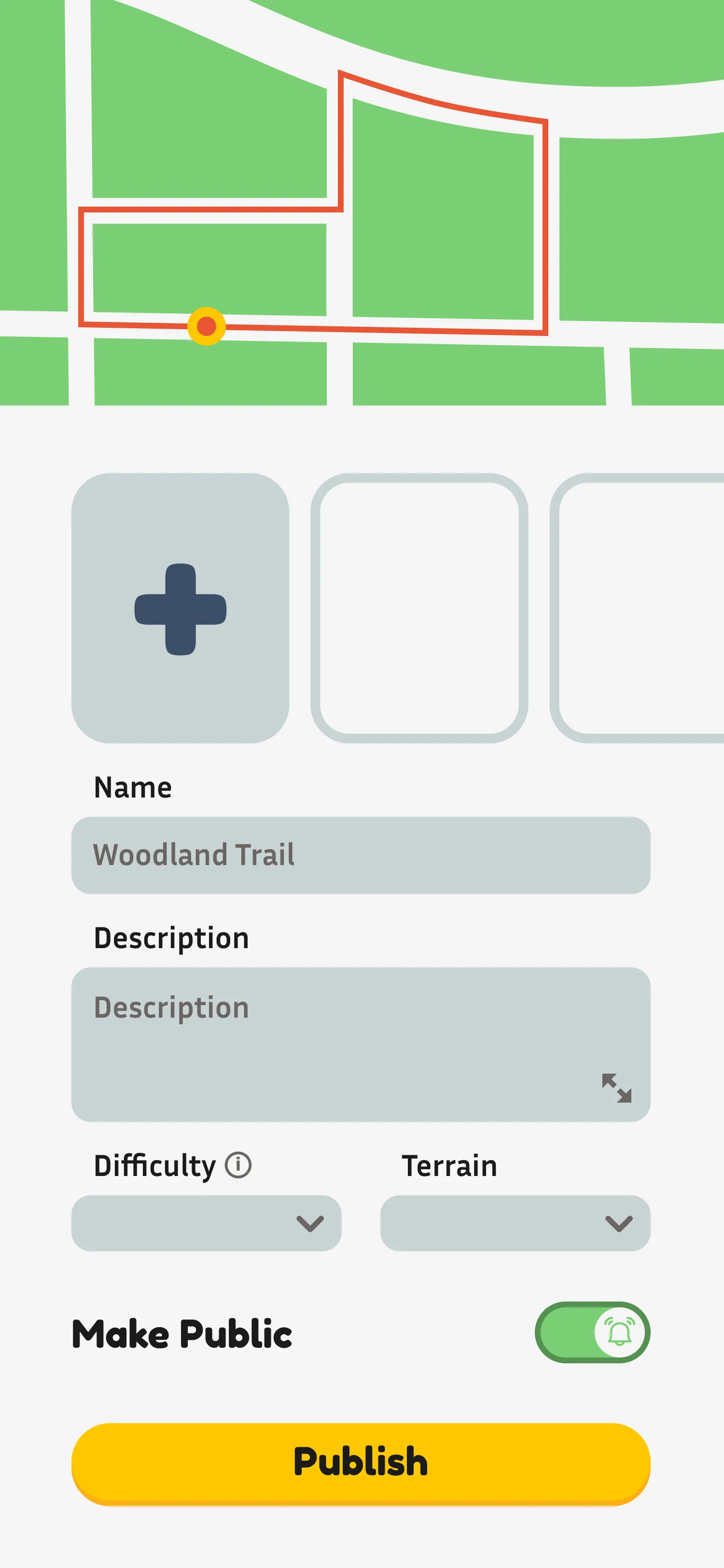
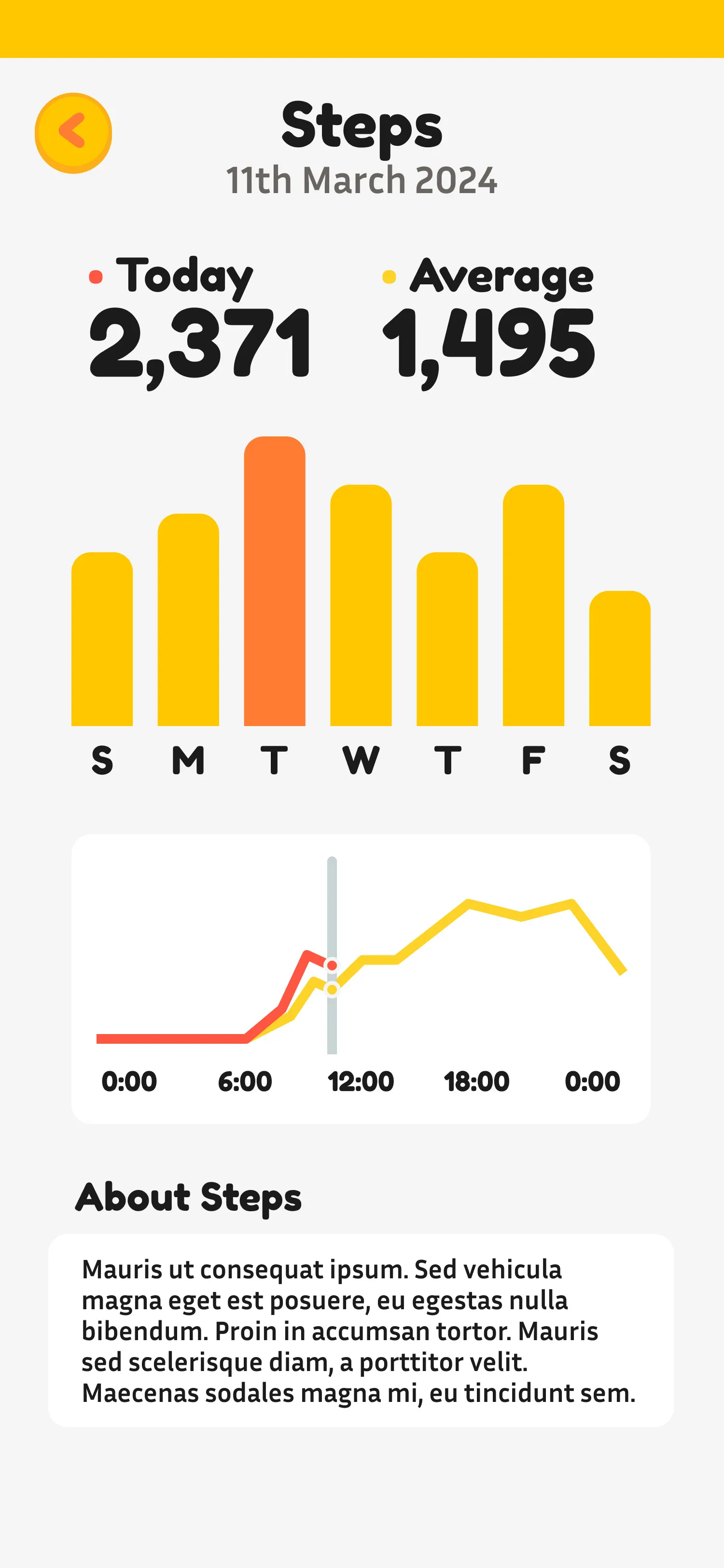
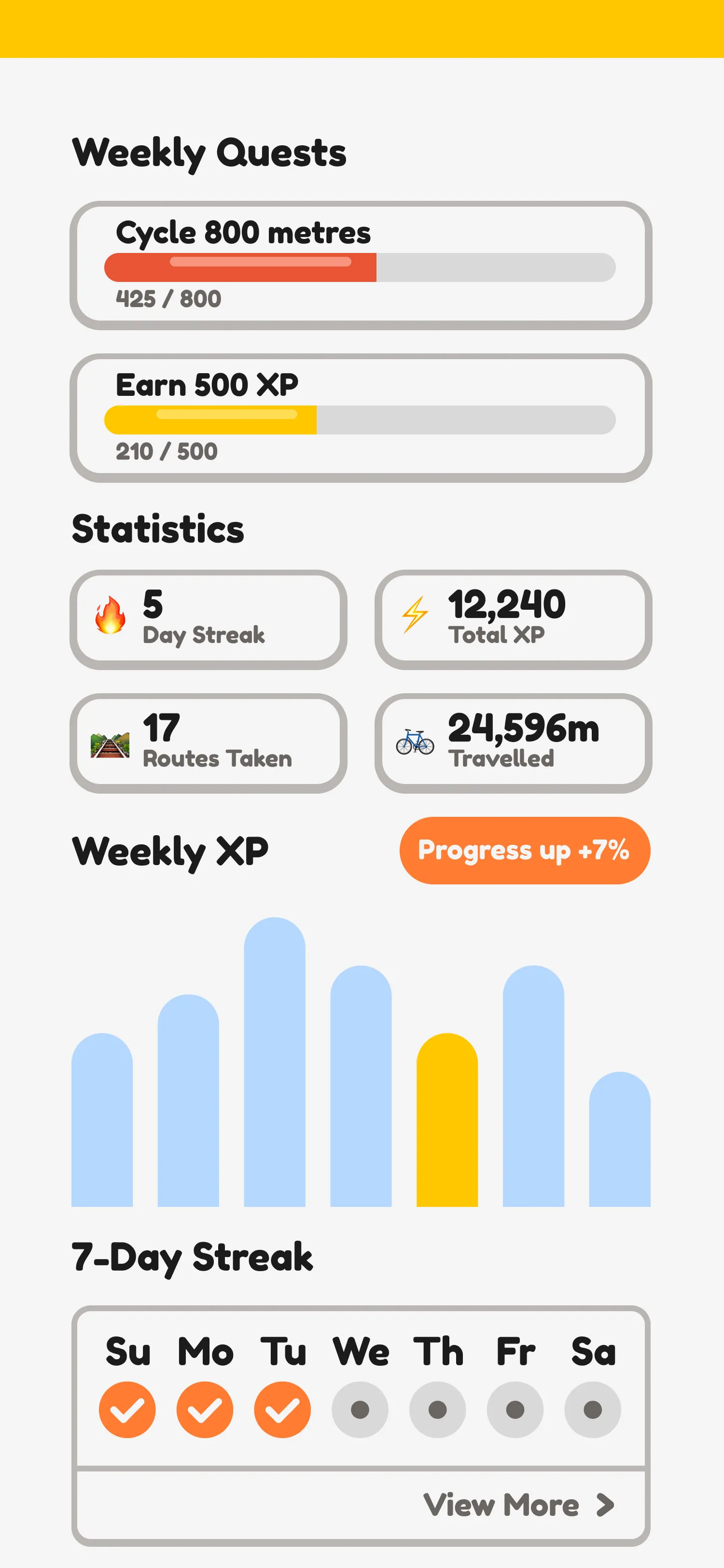
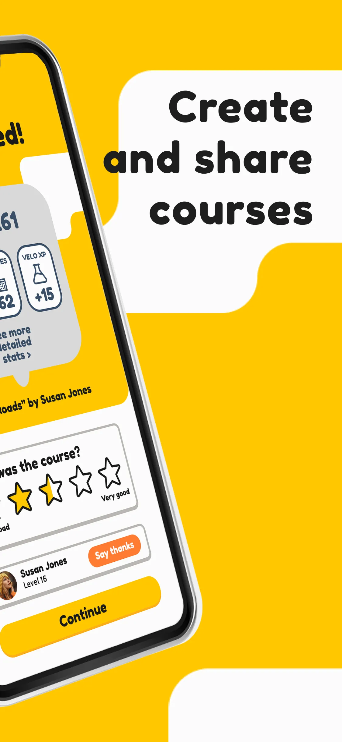
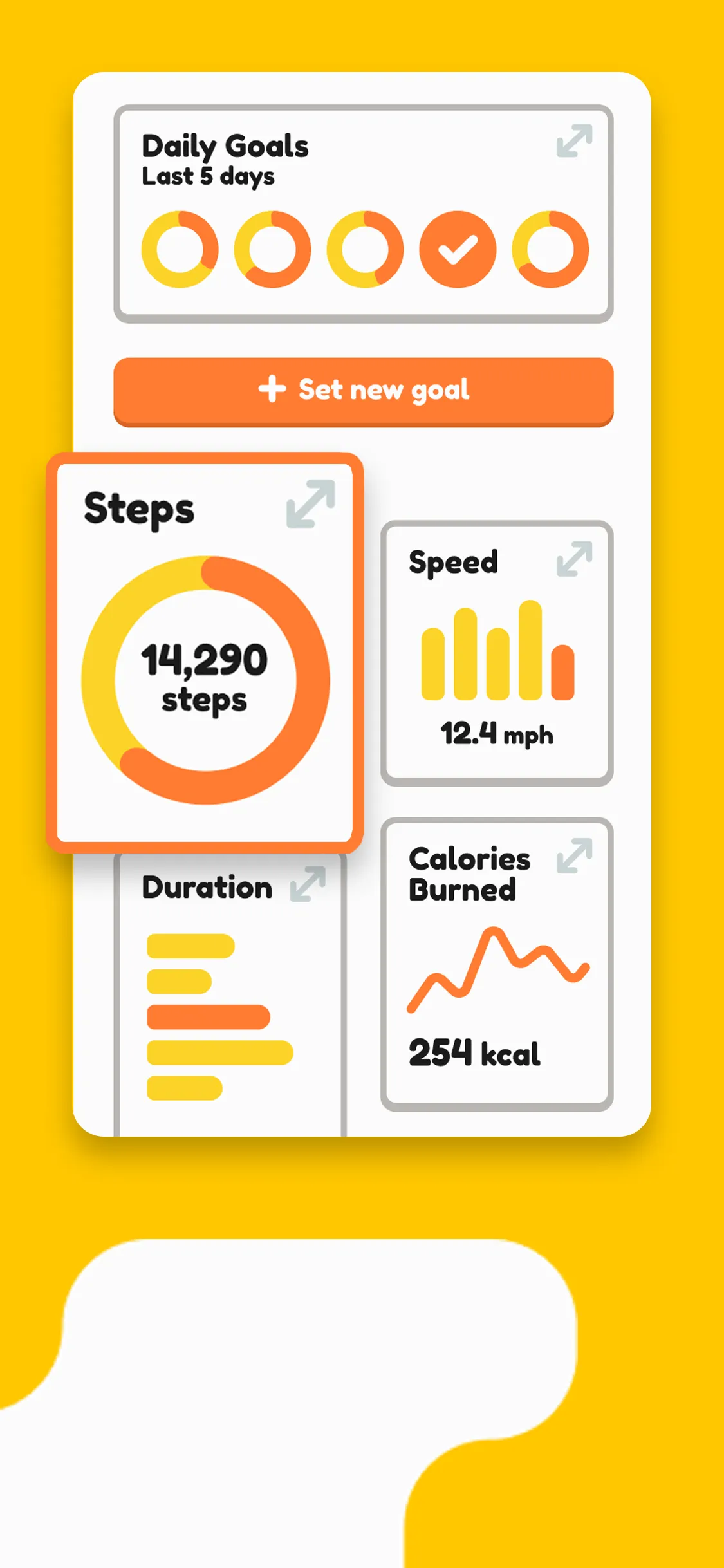
UI screens across all major flows — home, tracking, social, stats, and quests.
I used Attention Insight to pressure-test my layouts. The AI tool generates heatmaps predicting where users' eyes are likely to land on a screen — which revealed a few assumptions I'd made that didn't hold up. I adjusted layouts accordingly, sharpening the hierarchy across several key screens.
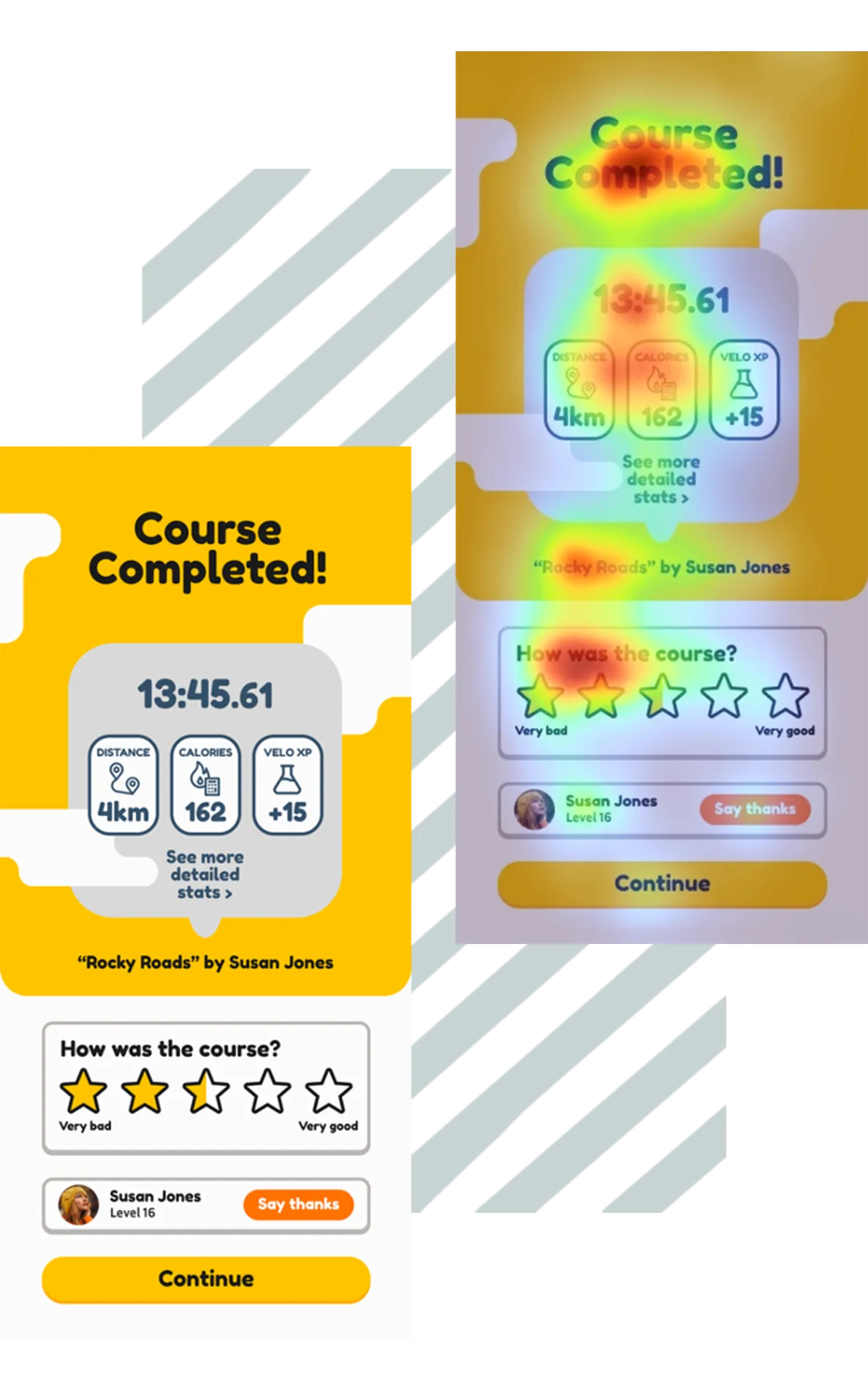
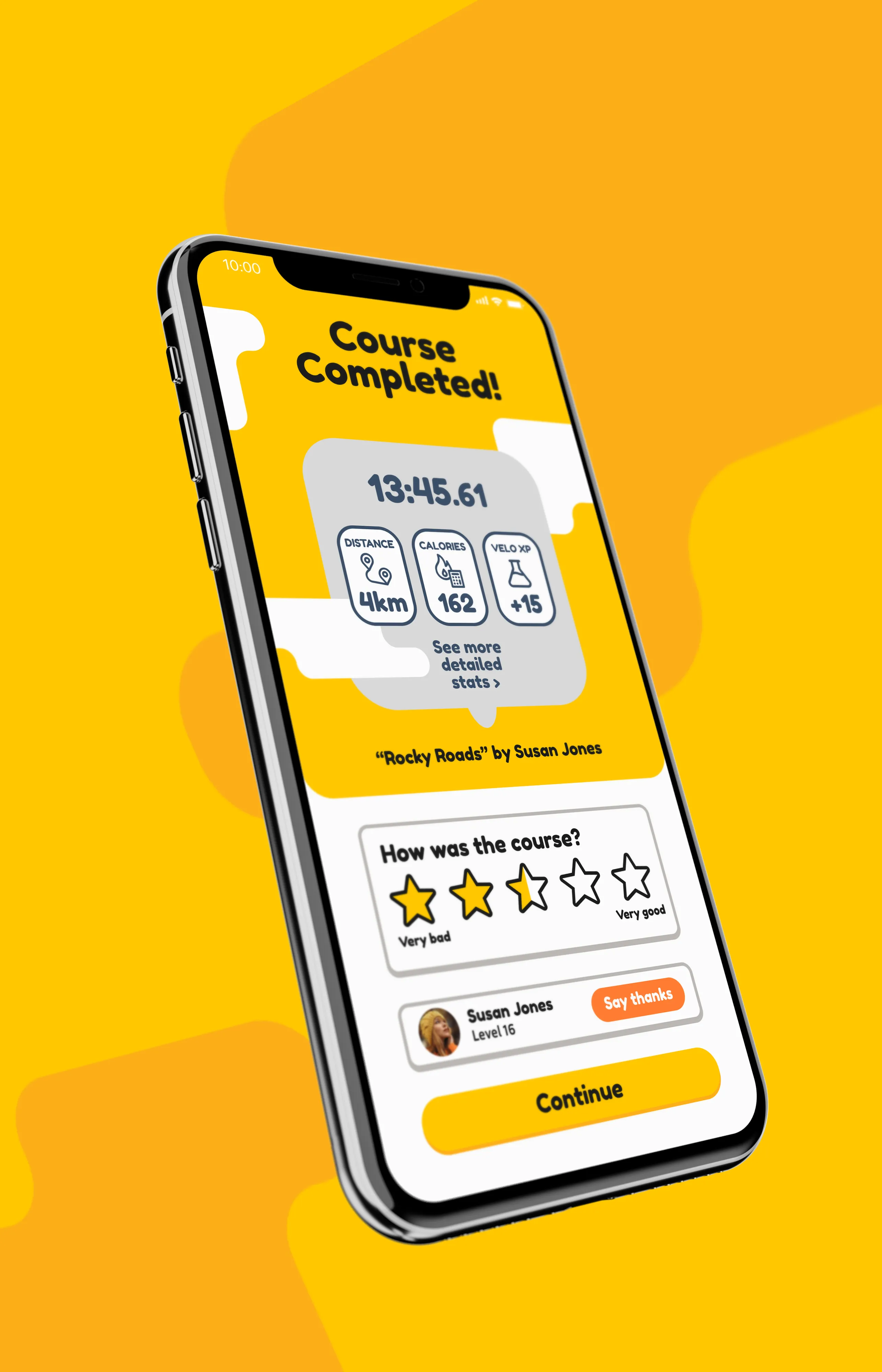
Attention Insight heatmap (left) used to refine layout hierarchy. On-device mockup (right).
Logo animation — built in After Effects as part of the onboarding experience.
Onboarding splash screens — the first three steps of the new user flow.
Advertising
The app needed a campaign as well as a product. I designed a series of billboard and promotional ads to extend the brand beyond the app itself — making sure the same recognisable elements translated to large-format print. The billboards had to feel immediately like Velo without relying on the UI to do the work.
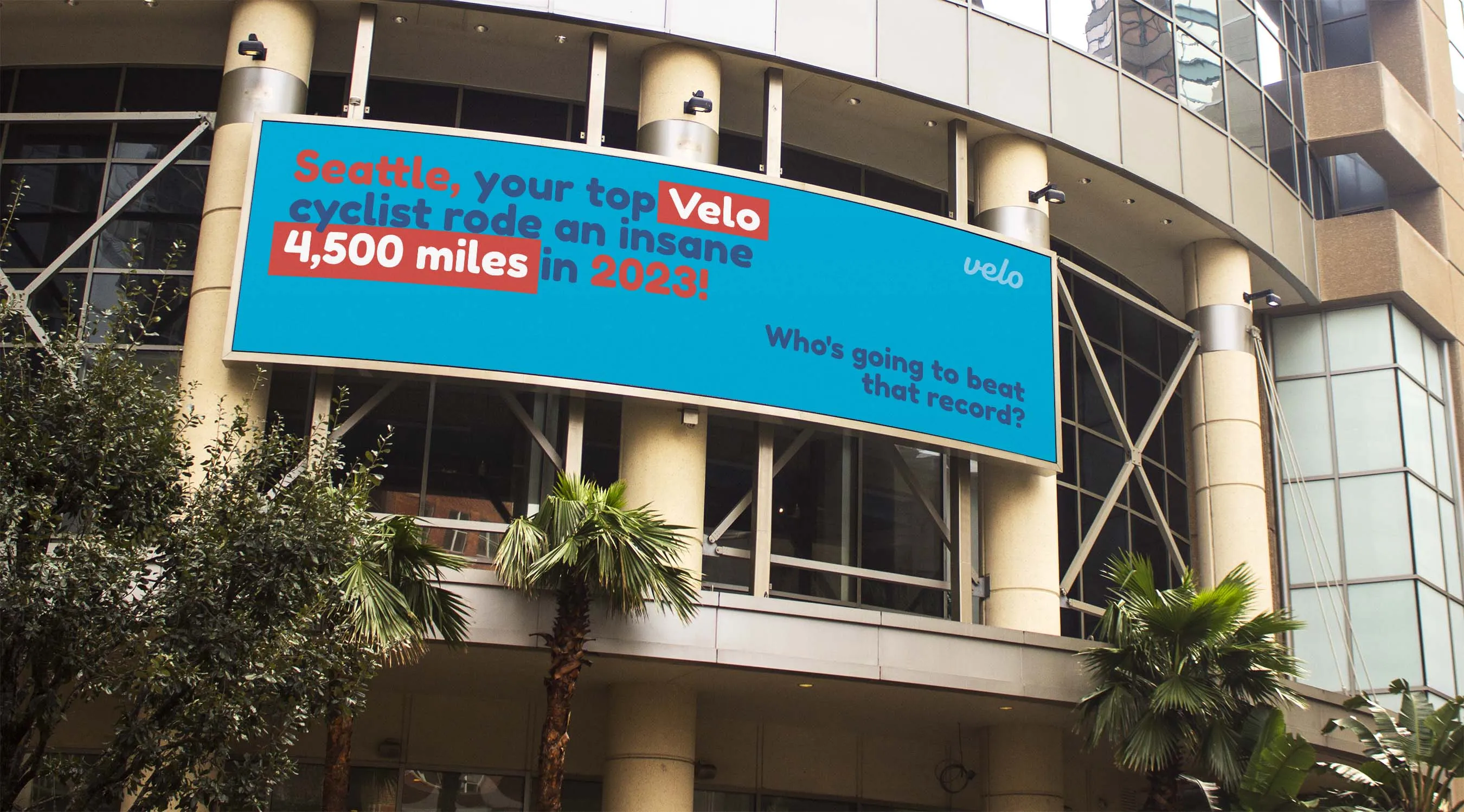
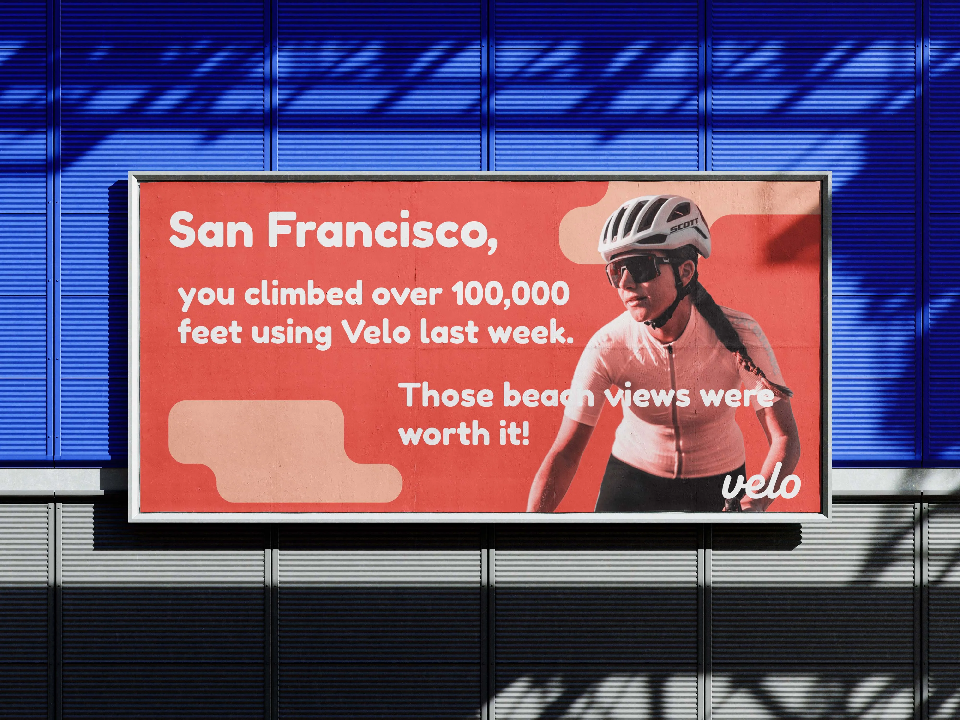
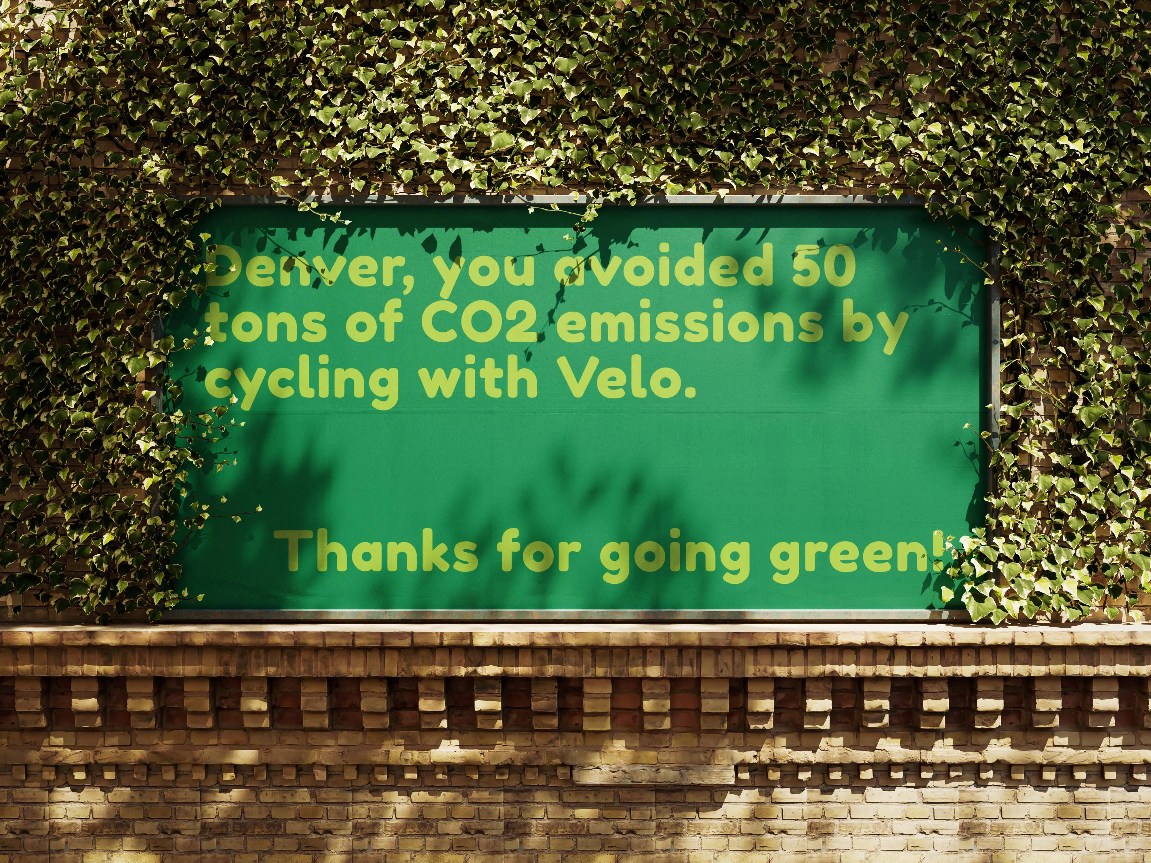
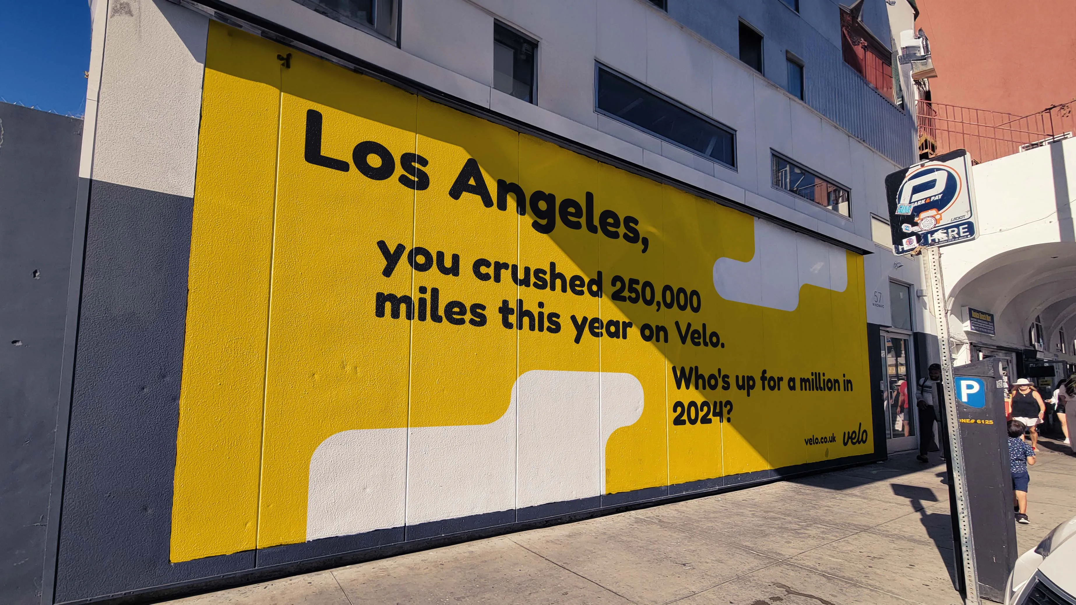
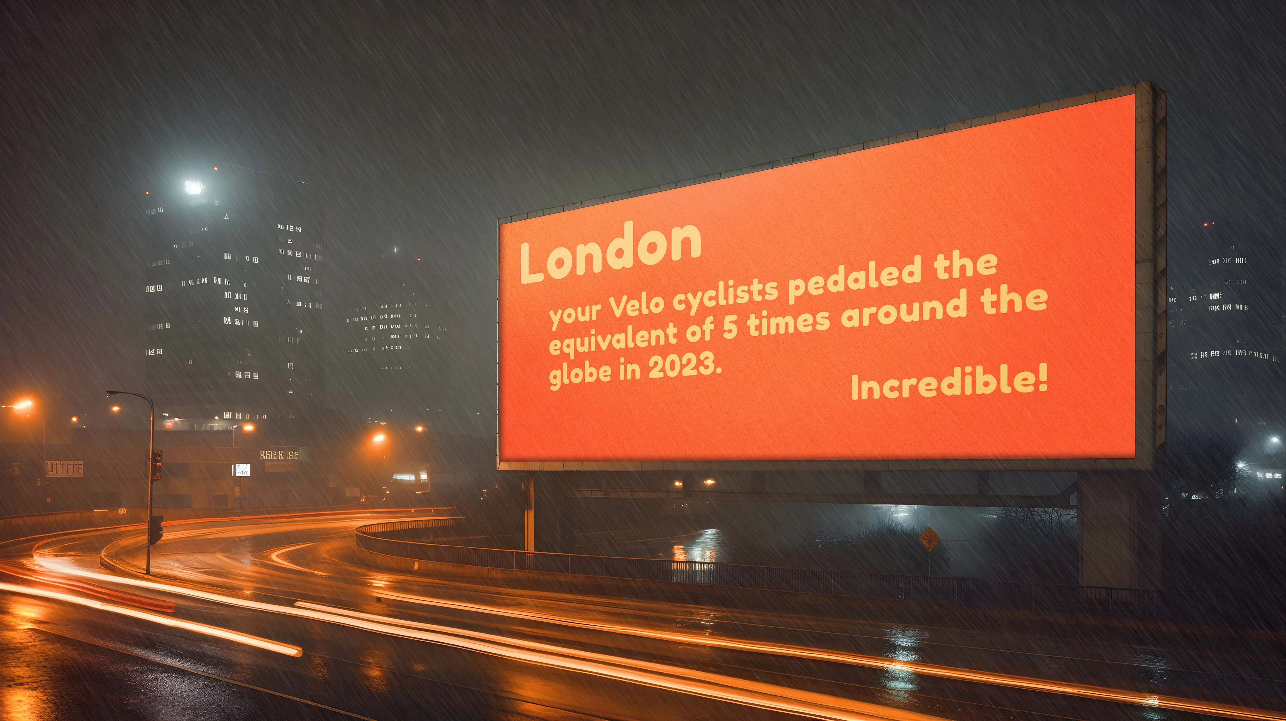
Billboard campaign — five placements across outdoor advertising formats.
Video advertisement
I produced a video advertisement for Velo entirely solo — copywriting, editing, and motion graphics. I used drone footage of Bournemouth to give the ad a cinematic quality that felt a step above what you'd expect from a foundation project, and brought After Effects in for the animated elements.
Velo — finished video advertisement. Directed, edited, and animated solo.
What I learned
Velo taught me more in one project than anything I'd done before it. Designing a full brand, a complete UI system, and an advertising campaign solo — from research to finished mockups — was the most ambitious thing I'd attempted, and doing it on a foundation course made the learning curve steep.
It also introduced me to Figma, which has since become my primary design tool for almost everything. Starting from zero and building something I was genuinely proud of in an unfamiliar piece of software is probably the thing I'm most satisfied about looking back.
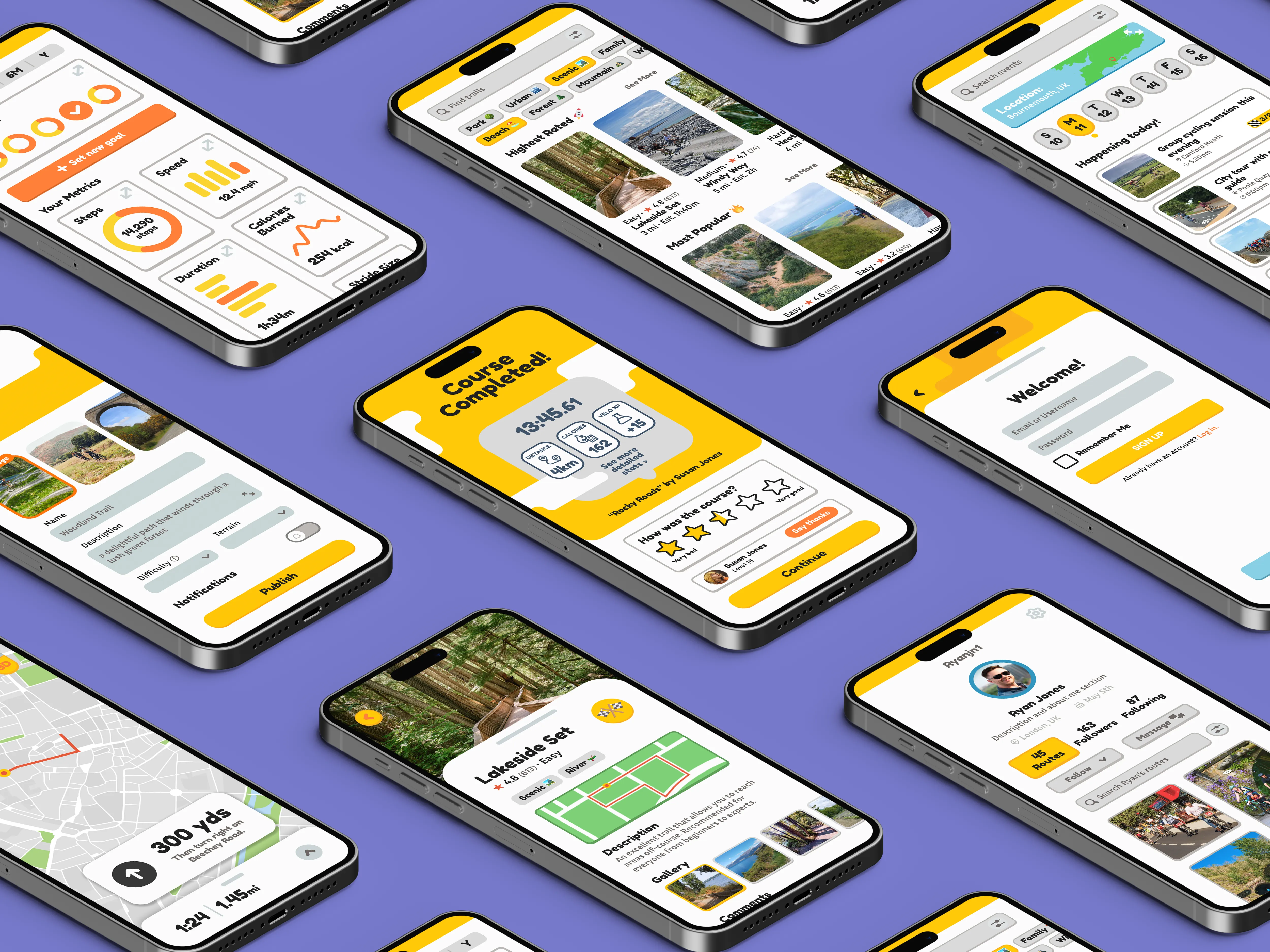
Full UI screen grid — the complete Velo app laid out across all flows.
Bibliography
- ---
- ---
- ---